
30 Best Interactive Websites & Examples to Try 2026

The best interactive websites give you something to do: draw, type, drag, spin a globe or play a game, and the page answers straight away. These 30 are grouped by what they ask of you, from games and stories to maps, brand sites and portfolios, and each comes with a short clip we recorded while using it. If you want to build one, start from our interactive website templates.
What Is an Interactive Website?
An interactive website changes in response to what the visitor does. A static page shows everyone the same thing and waits to be read; an interactive one lets you draw, drag, type, press keys or explore, and answers each action immediately, often with motion and sound.
By that test, a hover effect or a scroll animation alone is not enough: every site below gives the visitor a job. They fall into five groups:
How We Picked These Interactive Websites
We opened 78 candidate sites, including all twenty from the previous version of this list and the examples other interactive roundups cite most often, and kept only those where a visitor can do something that changes what they see. We then used each one and recorded it, so every clip below shows a real interaction, not a still screenshot.
Most sites on the old list were agency homepages with animation but little to do, so they were dropped. The three genuinely interactive ones, Bruno Simon’s driving game, Lusion and Active Theory, now appear on our animated website examples list instead. Several sites that other lists still recommend have gone offline or become unrelated businesses, so we left them out.
Interactive Games and Toys
Sites whose whole point is play: draw, type, spin or tap, and the page answers right away.
1. Quick, Draw!
Built with: Custom code, Paper.js, a neural network

Google’s Quick, Draw! asks a simple question, “Can a neural network learn to recognize doodling?”, and turns the answer into a game. You get a word to draw against a countdown, and while you sketch, the computer calls out its guesses until it gets it right.
Every drawing joins what Google calls the world’s largest doodling data set, which is shared publicly for machine learning research. It works because the loop is instant: each stroke changes the guesses, so you keep drawing to see what the machine thinks.
What stands out: A game that doubles as a research data set.
2. Patatap
Built with: Custom code, Two.js

Patatap is “a portable animation and sound kit”: press any key from A to Z, or the spacebar, and each one fires a sound with its own shape, a spinning square, a ring, a burst of dots, across a flat colored screen. Type fast and it becomes a short piece of music with visuals.
It was made by Jono Brandel with the Japanese sound studio Lullatone and draws its shapes with Two.js, a two-dimensional drawing library. The whole instruction fits in one line on the screen, and the site warns up front that it contains flashing images.
What stands out: Every key answers with sound and motion at once.
3. Tarot-o-bot
Built with: Custom code, Lottie

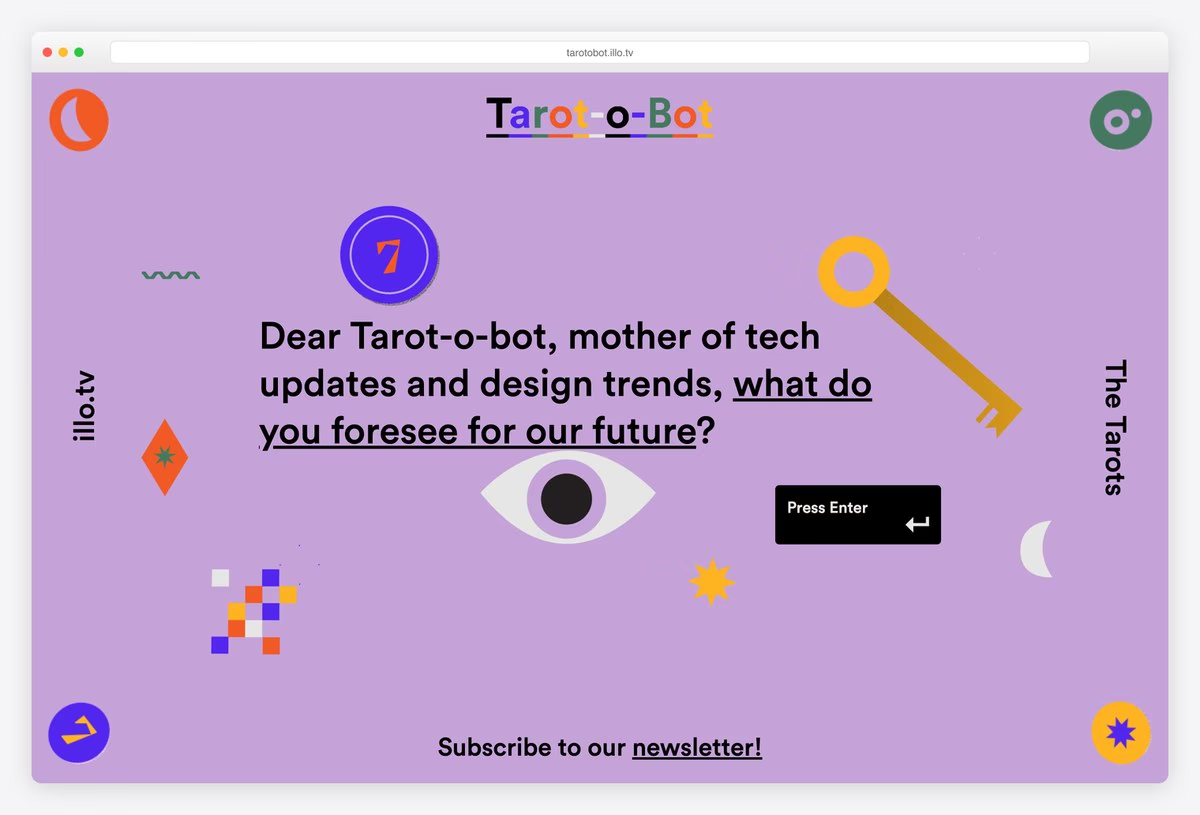
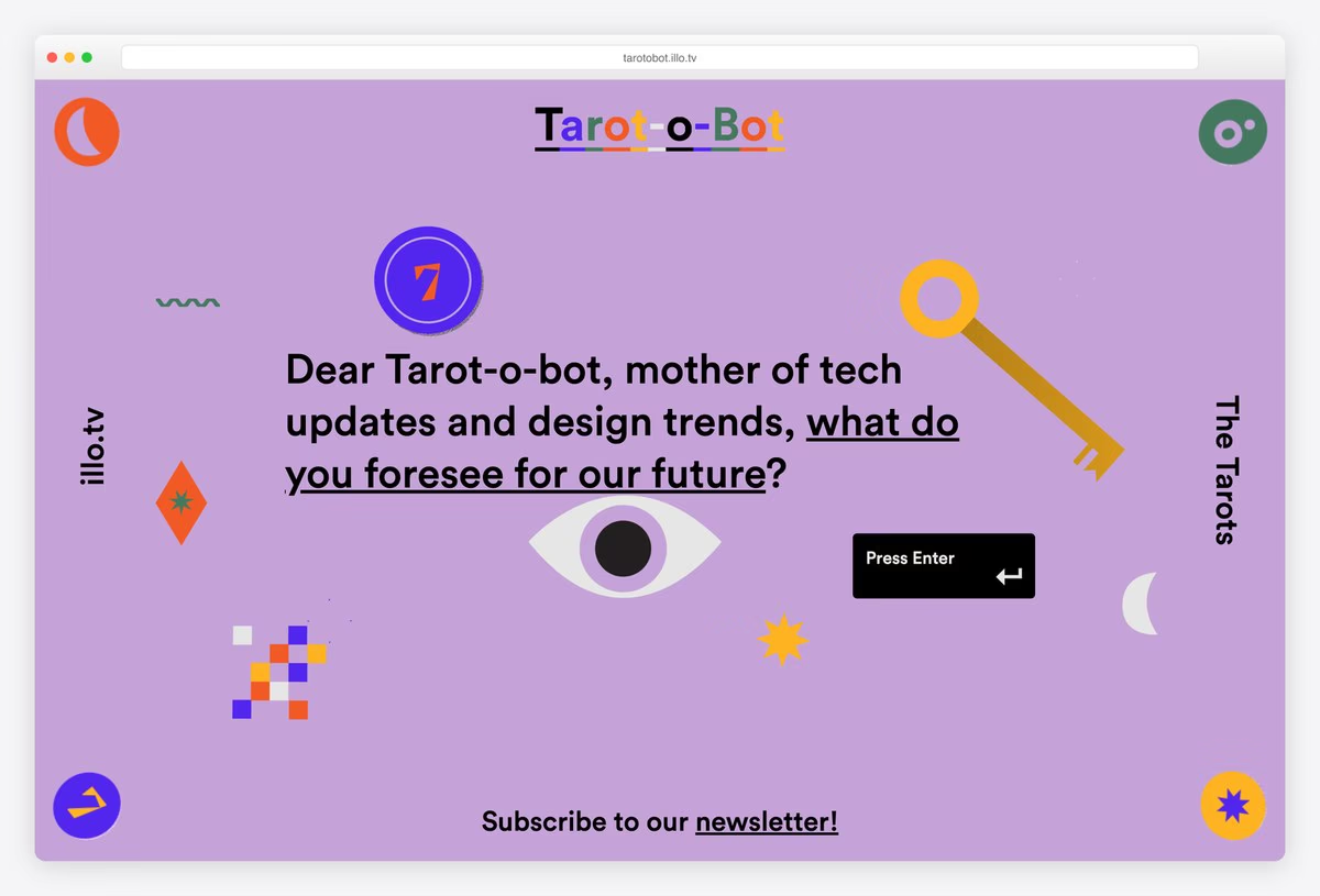
The creative studio illo built Tarot-o-bot as a fortune teller for the design industry. You ask “Dear Tarot-o-bot, mother of tech updates and design trends, what do you foresee for our future?”, press Enter, and three illustrated cards spread out for you to turn over.
Each card turns over to reveal an illustrated prediction in illo’s bright, graphic style, with small Lottie animations bringing the symbols to life. It is a self-promotion piece, but it gives the visitor a ritual to perform instead of a portfolio to scroll.
What stands out: One key press turns a studio showcase into a card reading.
4. Blobmixer
Built with: Custom code, React, three.js

Blobmixer by the studio 14islands is “a toy for creating and sharing 3D blobs”. Each blob has a name, such as Fomosphere, and a glossy, iridescent surface; drag to spin it, flip through the next shapes, or mix your own and share the link.
It runs on three.js with React, and the page offers a VR mode as well. There is no text to read and no sales pitch, which is exactly why other designers keep citing it: the site is only the toy, and 14islands’ name sits quietly in the corner.
What stands out: A shareable 3D toy that markets its studio without saying so.
5. Silk
Built with: Custom code, canvas

Silk, made by Yuri Vishnevsky with music and sound by Mat Jarvis, turns your mouse into a brush of glowing thread. Whatever you draw is mirrored around the center, so a few quick strokes become an intricate, symmetrical pattern.
Controls let you switch rotational symmetry, mirroring and a spiral mode, press Space to start again, and save or share the picture; shared art is licensed under Creative Commons. It is a clear lesson in making a tool feel generous: nobody can draw badly in it.
What stands out: Symmetry makes every visitor’s drawing look good.
6. Weglot Like Magic
Built with: Webflow

Weglot, the website translation service, and the agency Refokus built Weglot Like Magic as a word game: behind a glowing eye and the button “Let the magic begin!”, a 90-second word game asks you to work out five words from other languages.
It was made for a Webflow conference and runs on Webflow, which is part of the point, since Weglot plugs into Webflow sites. The game tests exactly the problem the product solves, so it sells translation by making you feel the gap first.
What stands out: A brand game about the exact problem the product solves.
7. Chrome Music Lab
Built with: Custom code, Tone.js
Chrome Music Lab is Google’s set of free experiments that “makes learning music more accessible through fun, hands-on experiments”. In Kandinsky, one of them, everything you draw becomes sound: lines turn into melodies, and circles and triangles turn into little singing faces.
The experiments are built on Tone.js, the web audio framework, and need no sign-up or instructions. Teachers use them in classrooms to connect music with science, maths and art, which is a good reminder that interactivity can be the lesson itself.
What stands out: Drawing becomes music with no instructions needed.
Interactive Storytelling Websites
Stories that move only when you do, from picture books to brand histories.
8. Nomadic Tribe
Built with: Custom code, Vue, GSAP, WebGL

Nomadic Tribe is an interactive tale from the creative studio makemepulse, made as its new year greeting. Press Start and you step into an illustrated world of crystals and patterned landscapes, moving the story forward screen by screen with Next.
The opening screen says it is “Best experienced with sound”, and the soundtrack carries much of the mood. It is built with Vue and GSAP on WebGL, and it shows how an agency can say thank you to clients with something they will actually spend a few minutes in.
What stands out: A studio greeting card you can walk through.
9. Ateliers Heschung Christmas Story
Built with: Nuxt

The French shoemaker Ateliers Heschung told its story as an illustrated Christmas experience, drawn by the artist Vincent Broquaire. After “Commencer l’expérience”, a single line wanders across the page, sketching the brand’s history chapter by chapter, and the space bar starts each part of the story.
The site is in French and English and built with Nuxt. Nothing here is a product grid; the illustrations turn a family business and its craft into a short, playful journey, which suits a heritage brand better than another banner.
What stands out: Brand heritage told as a hand-drawn journey.
10. Oggy!
Built with: Custom code, WebGL

Oggy! is an illustrated and animated story made for a child named Mahé, starring a small child and a green dragon. You move between scenes with arrows or by picking a color, and each scene is a painted room, from a nursery at night to a kitchen, that comes alive as you arrive.
The illustrations are by Donatelle Liens, with development and design by Willy Brauner, and the story is available in French and English. It is a personal project, and a lovely model for picture-book storytelling on the web.
What stands out: A picture book where every page moves.
11. Rose Island
Built with: Webflow, three.js, GSAP

Rose Island tells the true story of “a short-lived micronation on a man-made platform in the Adriatic Sea”. The site opens on a realistic 3D render of the platform rocking on the water under huge orange lettering, with a button to watch the film about it.
Scrolling unfolds the history with archive-style type and imagery. It is built on Webflow with three.js and GSAP, and it shows how a film or documentary can use its website as a teaser you explore rather than a poster you glance at.
What stands out: A 3D teaser that makes a history lesson feel like a place.
12. Une Mini Aventure
Built with: Webflow, Lottie

Une Mini Aventure is a short French story that plays as you scroll: “Gus passait une paisible journée au bord du lac…” (Gus was spending a peaceful day by the lake), and then something happens. Line drawings, waves and shapes animate in as each sentence arrives.
It opens with a Jean-Paul Sartre line about how the most ordinary event becomes an adventure once you start telling it, which is the idea of the whole piece. It is a Webflow build with Lottie animations, proof that scroll storytelling does not need a big budget.
What stands out: Scroll storytelling on a small scale, done well.
Explorable Maps, Data and Worlds
Data and places you navigate with your own hands, from the solar system to the bottom of the ocean.
13. 50 Years of Swiss Music Charts
Built with: Custom code, three.js

SRF 3, the Swiss radio station, turned five decades of its hit parade into a 3D universe: every song is a star, and you scroll and drag through the constellations of years to find a track, then open it for the details.
It is built with three.js, and the site is honest about its limits: a note says the 3D experience “isn’t accessible to screen readers” and points visitors to the regular Hitparade website instead. That fallback is as worth copying as the starfield.
What stands out: Data you fly through, with an honest accessible fallback.
14. NASA’s Eyes on the Solar System
Built with: Custom code, three.js

NASA’s Eyes on the Solar System is a real-time 3D model of the solar system in your browser. Drag to orbit the Sun, zoom from the planets out to the Milky Way, and follow spacecraft such as Voyager 1, Parker Solar Probe and Europa Clipper along their actual paths.
Built by NASA’s Jet Propulsion Laboratory with three.js, it doubles as a live tracker, with featured events such as launches and flybys listed down the side. It shows what interactivity adds to science communication: you learn the scale of space by moving through it.
What stands out: A science lesson you steer yourself.
15. earth.nullschool
Built with: Custom code, WebGL

earth.nullschool is “a global map of wind, weather, and ocean conditions”, drawn as glowing, flowing lines across a globe you can spin with the mouse. The data comes from supercomputer forecasts and is updated every three hours.
The menu switches between layers for wind, weather, ocean conditions and pollution. It is a small, single-purpose site, and it has become a standard reference simply because moving the globe feels so direct.
What stands out: Live data made tangible by one drag gesture.
16. Radio Garden
Built with: Custom code, React, WebGL

Radio Garden lets you “Explore live radio by rotating the globe”. Press play, spin the planet, and every green dot is a city with live stations; drop the circle in the center on one and you are listening to local radio from the other side of the world within seconds.
The globe is the whole interface, with favorites, browse and search tucked into a small panel. It is a clear example of choosing one metaphor and building everything around it, and the reason people lose an hour on it.
What stands out: The map is the whole interface.
17. WindowSwap
Built with: Squarespace

WindowSwap offers to “Open a window somewhere in the world”: one click plays a short, quiet video of the view from a real person’s window, with the city and the name of whoever shared it, and another click takes you somewhere else.
Anyone can submit their own window, and paid access unlocks every window ever uploaded, bookmarks and playlists. It is proof that an interactive website does not need to be technically showy: one button and a good idea are enough.
What stands out: One button and a good idea, nothing more.
18. The Deep Sea
Built with: Custom code

The Deep Sea by Neal Agarwal is one long scroll from the surface to the bottom of the ocean. A depth counter ticks down in meters while fish, whales and stranger creatures appear at the depths where they really live, through zones such as The Twilight Zone.
It is part of Neal’s site neal.fun, a collection of games, visualizations and interactives. The scroll bar does all the work here: its length becomes the depth of the ocean, so you feel how far down the deepest animals are.
What stands out: Scrolling used as a unit of measurement.
Interactive Brand and Business Websites
Proof that interactivity is not only for experiments: an airline, a fashion concept, a tattoo studio and an artist.
19. Hi Fly
Built with: Custom code, three.js, PixiJS, GSAP

Hi Fly, a wet lease and charter airline, shows that interactivity belongs on commercial sites too. The home page opens in the clouds (“Preparing for take-off.”) before one of its aircraft glides into view, and a 3D Experience in the menu lets you explore the fleet.
It is custom code with three.js, PixiJS and GSAP, and it includes a detail most 3D sites skip: a HIGH, LOW and OFF switch for the effects, so visitors on slower devices can turn them down.
What stands out: A business site with a quality switch for its 3D.
20. Chrono
Built with: Webflow, three.js, GSAP, Howler.js
Chrono is a concept fashion brand of “retrofuturistic garments”, built as a Webflow showcase. The site asks you to “Click anywhere to start”, recommends sound, and assembles a 3D figure in a reflective suit before the CHRONO wordmark and the collection appear.
Under the hood are three.js, GSAP with ScrollTrigger and Howler.js for audio, and the loader even narrates what it is doing (“PRE-FETCHING 3D MODELS…”). It is a useful reference for how far Webflow can go with custom code on top.
What stands out: A loader that turns waiting into part of the show.
21. Momday Club
Built with: Framer

Momday Club, a private tattoo studio in Las Palmas de Gran Canaria, puts a tattoo machine in your cursor. The home page invites you to make your own tattoo by clicking and dragging, and then admits, in Spanish, that it has made clear the studio is better at it than you are.
It is a small Framer site for a small business, and the joke is the pitch: you try, you scribble, and you want a professional. The studio’s address and booking details sit right below.
What stands out: A small business that lets you try the craft.
22. Artificialia Digital
Built with: Webflow, three.js

Artificialia Digital is “a virtual interactive presentation” of the artist Bridgette Ashton’s Artificialia cabinet, a collection of ceramic sculptures. Pick one from the grid and it rises in 3D, turning slowly with its title while the others slide away.
It is built on Webflow with three.js, and it replaces the usual gallery lightbox with something closer to handling the object. For artists and makers, it is a strong example of letting people look at work from every side.
What stands out: An online gallery where you can turn the pieces over.
Interactive Portfolios and Studios
Designers, developers and studios who let visitors play with the work instead of just scrolling past it.
23. Peter Oravec
Built with: Custom code, WebGL

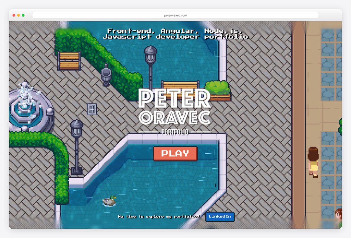
Front-end developer Peter Oravec turned his portfolio into a pixel-art game. Press Play and you walk a small character through a world with a train station and fountains, while the menu (About me, CV, Projects, Technologies) waits at the top for anyone in a hurry.
He also adds a shortcut, “No time to explore my portfolio?”, which links to his LinkedIn. That escape hatch is what makes the game work for recruiters as well as for other developers.
What stands out: A game portfolio with a shortcut for busy readers.
24. My Developer Journey
Built with: Custom code, React, Howler.js

My Developer Journey is the interactive resume of Bruno Santos, a full-stack developer in Portugal. Scroll and a tiny pixel character runs through a city past billboards and buildings, each one a stop in his career, from his graphic design course in Lisbon to the agencies he worked for.
It is custom code with React and Howler.js for sound, with a mute button and hearts in the corner like a platform game. The format turns a timeline, the dullest part of a resume, into the part you remember.
What stands out: A career timeline told as a side-scrolling game.
25. Martin Cremerius-Gauer
Built with: Custom code, CSS

Martin Cremerius-Gauer, a web front-end developer and FPV drone pilot, greets you with a pixel self-portrait and “Press here to start”. Do it, and a Game Boy flips over and powers on; the label on its back reads MADE WITH CSS.
You then navigate his projects on the console’s screen with the keyboard, including indie games and a physics video series, with a help overlay listing the keys. The whole thing is a nostalgic joke and a skills demo at once.
What stands out: A CSS Game Boy that doubles as a skills test.
26. Salvatore Casalino
Built with: Custom code, three.js

Salvatore “Sasy” Casalino, a mobile developer, says he builds “mobile apps that look like toys but perform like tools”, and his site behaves the same way: a bright blue page with a Tap me! phone, bouncy type and, further down, a resume presented as a Super Mario level.
It is custom code with three.js, and the interactive resume states its purpose plainly: to entertain whoever wants to get to know him. It is a good fit between claim and site, since the portfolio is the proof of the toy-like apps he promises.
What stands out: The portfolio behaves like the apps he sells.
27. Dave Holloway
Built with: Astro, three.js, GSAP, Rive

Dave Holloway, a freelance designer and creative developer from Leeds, opens with an illustrated self-portrait and a big HEY! before the page becomes a playground: the work section floats project screens over a 3D landscape, and there are LAB and Fun Stuff areas to explore.
The stack is Astro with three.js, GSAP and Rive, one of the richest on this list. Despite the play, it stays a portfolio: services, about and contact are always in the top bar.
What stands out: Playful without hiding the contact button.
28. Niccolò Miranda
Built with: Webflow, GSAP

Niccolò Miranda, a designer and developer in Amsterdam, calls his site The Paper Portfolio. It looks like a printed newspaper, with his name as the masthead, and you “Drag sideways to navigate”: pages tear open to reveal each project full-screen.
It is built on Webflow with GSAP, and the torn-paper transition is the memorable detail. Picking one physical metaphor and applying it everywhere, from layout to navigation, is what makes the interaction feel natural rather than bolted on.
What stands out: One physical metaphor, applied to everything.
29. OHZI Interactive Studio
Built with: Custom code, three.js

OHZI Interactive Studio builds “3D interactive experiences for the web”, and its home page is a single glass cube with a glowing core that shifts from violet to blue, amber and green as you move and drag around it, with an Explore button below.
Behind it is three.js, and the studio lists immersive work for brands such as HTC and the World Bank. It is one of the sites other interactive roundups cite most, because it shows off the craft with one object instead of a busy showreel.
What stands out: One 3D object that responds to every move.
30. Wanted For Nothing
Built with: WordPress, three.js, GSAP

Wanted For Nothing, a tech and design consultancy in Los Angeles, turns its menu into the show: WORK, VIBES and SERVICES are giant words that blur and sharpen as you move, a ribbon of project names slides across them, and PICK YOUR VIBE and REFRESH controls sit in the corner.
It runs on WordPress with three.js and GSAP. The navigation itself is the interactive piece, which keeps the playfulness right where visitors have to go anyway.
What stands out: Navigation as the interactive centerpiece.
What Makes a Great Interactive Website?
Give one clear first action. The best sites here tell you exactly how to begin: Tarot-o-bot says “Press Enter”, Martin Cremerius-Gauer’s Game Boy says “Press here to start”, and Chrono asks you to click anywhere. A visitor who has to guess what to do usually leaves instead.
Answer every input immediately. Patatap plays a sound and a shape on the same key press, Quick, Draw! updates its guesses with every stroke, and Silk mirrors your line as you draw it. Instant feedback is what makes an interaction feel alive; a delay makes it feel broken.
Explain the controls in a single line. Patatap needs one sentence (“Press any key, A to Z or spacebar”), Niccolò Miranda’s portfolio says “Drag sideways to navigate”, and Momday Club tells you to click and drag. If the instructions need a paragraph, the interaction is too complicated.
Tie the interaction to the message. Momday Club lets you try tattooing before you book a tattoo artist, Weglot’s game is about the words its product translates, and Salvatore Casalino’s toy-like site proves he builds toy-like apps. When the interaction is the pitch, visitors remember both.
Keep a fast route to the content. Peter Oravec adds “No time to explore my portfolio?” with a direct link, Dave Holloway keeps his contact link in the top bar, and 50 Years of Swiss Music Charts points screen reader users to a regular website. Play is optional; the information should not be.
Make sound optional and say so. Nomadic Tribe and Chrono both tell you they are best with sound and offer a way to turn it off. Never start audio without a click, and never make sound the only way to understand what is happening.
Plan for weaker devices and touch screens. Hi Fly’s HIGH, LOW and OFF switch lets visitors turn down its 3D effects, and the drag and tap interactions on this list work on phones, where hover does not exist. Test on a mid-range phone before launch, and respect the reduced-motion setting.
Frequently Asked Questions
What is an interactive website?
An interactive website responds to what the visitor does. Instead of only displaying content, it reacts to clicks, drags, typing, key presses or scrolling with changes on the page, such as a game move, a new part of a story, a rotated 3D model or a result from a tool. Static pages are read; interactive pages are used.
What are examples of interactive website features?
Common interactive features include games and quizzes, drawing tools, product configurators, draggable 3D models, maps and globes you can explore, calculators, scroll-driven stories and interactive resumes. On this list you can see a doodling game with a neural network, a live radio globe, a tattoo you draw yourself and a portfolio you play as a pixel-art game.
How do I make my website interactive?
Start with one interaction that serves your goal, such as a product preview, a quiz or a map. No-code tools like Webflow, Framer and Wix include interactions and animations; WordPress themes and page builders add similar features. For custom work, developers use JavaScript with libraries such as GSAP for animation and three.js for 3D, as many sites here do.
Are interactive websites bad for SEO?
Not if the content stays in the page as real text. Search engines cannot play a game or read words drawn inside a 3D canvas, so keep headings, descriptions and key information in HTML, and make sure the page loads quickly. A heavy interactive intro can hurt Core Web Vitals, so lazy-load large scenes and keep the first screen light.
What is the difference between a dynamic and an interactive website?
A dynamic website builds its pages from data, so content changes depending on the user, the time or a database, like a news feed or a shop. An interactive website responds to what the visitor does on the page. Many sites are both: an online store is dynamic, and its product configurator or filters make it interactive.
Are interactive websites accessible?
They can be, but it takes deliberate work. Make every interaction usable with a keyboard, respect the reduced-motion setting, provide text alternatives for anything visual, and offer a plain route to the content, as 50 Years of Swiss Music Charts does by pointing screen reader users to a regular website. Test with a screen reader before launch.
Wrapping Up
For motion you watch rather than play with, see our animated website examples, parallax scrolling websites and SVG animation examples. Ready to build your own? Start from our interactive website templates or interactive WordPress themes.
Browse the other Design styles & page types website examples (20 more collections), or see website examples for every industry.
Was this article helpful?
YesNo

