
CTA Examples: How to Write a Call to Action


Hey, you! Check this out! Over here!
Do we have your attention?
While the best calls to action may not involve obnoxiously shouting at your readers (sorry), the example above does showcase what we’re talking about here today.
Calls to action (CTAs) are incredibly important website elements that can help you make the most out of your existing website.
The good news is, with a little forethought, you can easily write an effective call to action. Using the right messaging at the right time can motivate people to buy products, read your blog post, or click on a link. CTAs are the gateway to everything from conversions to lead generation.
What is a call to action (CTA)?
A call to action (CTA) is the ask: a button, link, or line of copy that tells someone exactly what to do next, whether that’s buy, subscribe, download, or donate. To write one, fix your goal, pick your audience, choose plain benefit-led words, lower the risk, and design it to stand out. The 25 examples below show the method in action, and a section on CTAs in written work covers the ask in essays, proposals, and closing lines.
People use “CTA” two ways, and both are correct. There’s the web and marketing sense (the button, pop-up, or banner you click) and the writing sense: the ask in the last line of an essay, a business proposal, a pitch email, or a social caption. Same job, different medium. This post covers both. The 25 examples focus on the web version, and there’s a section further down on CTAs in written work.
Call to Action
A Call to Action (CTA) is a button or link that prompts users to complete an action, such as joining the email list, making a purchase, or downloading a document.
Read More
A CTA’s main goal is to direct readers to a course of action, and a thoughtful, personalized call is the best way to do that. CTAs give your visitors motivation and a reason to engage with your brand.
How to write an effective call to action
Not sure where to start? Here are our five tips for baiting those clicks without being clickbait.
1. Know your end game
First things first, consider what you want to accomplish on your website. Are you working to increase page views, improve your conversion rate, or strengthen relationships with customers? Whatever your end goal, your calls to action should reflect that purpose.
The type of call you use for lead generation (for instance: a “Download Now” button) will be different from what you might use for increasing sales. It’s important to think ahead before plastering buttons all over your site.
Makeup subscription brand Birchbox’s landing page entices visitors to join their monthly service and watch an accompanying video. They’re hunting sales with this CTA:

On the other hand, Madewell wants to grow its email list. This clothing company invites visitors to subscribe with a clever pop-up message:
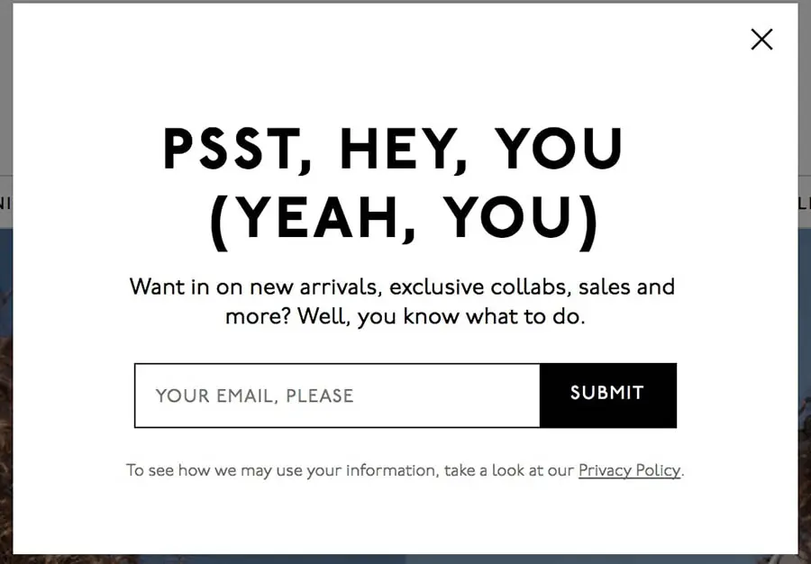
Taking the time to map out a few goals will help guide your decisions regarding word choice and design. Ultimately, a thoughtful plan will strengthen your site’s output (like stats and sales)!
2. Pick your target audience
Every internet user is different! What they’re doing on the web (whether that’s scanning the news, binge-watching Netflix, or scouring shopping deals) is unique. Therefore, when creating effective CTAs, you need to consider the diverse audiences interacting with your site.
For compelling CTAs, you need to identify the groups you want acting on your message. Since you’ll probably want each group to do different things, you’ll need to tailor messaging accordingly. For example, the Minimalist Baker food blog targets new visitors with a free, exclusive e-book:

What if you want to target users who are already engaging with your brand? In this case, you can prompt them to register for your monthly newsletter and receive restock reminders:
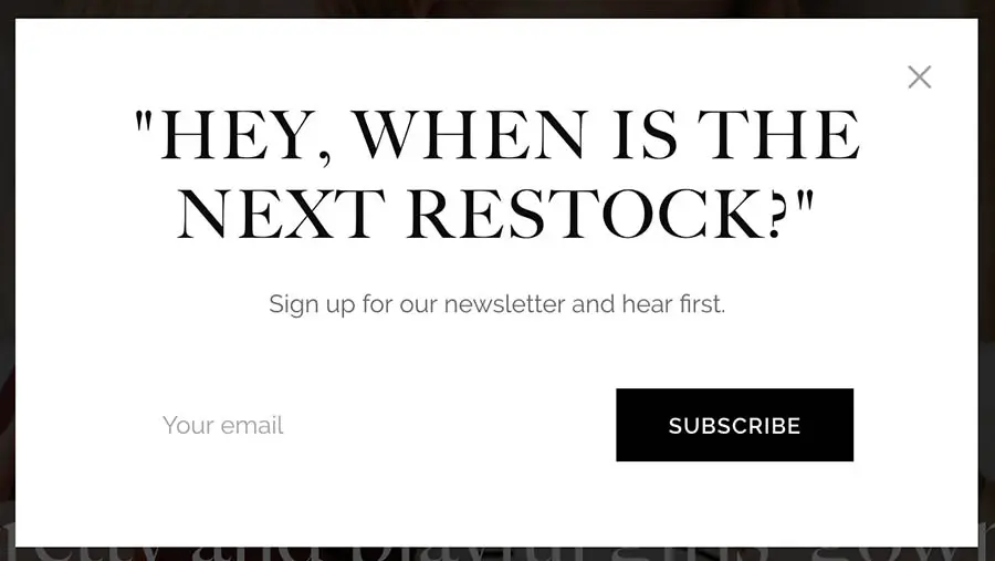
So before taking pen to paper and drafting your calls, determine who you’re trying to target. This will help you craft a CTA that your audience will want to interact with.
3. Choose your words wisely
One of the most challenging elements of a CTA is creating the copy. This is a critical step, as the words you choose can make a big difference in how and whether users respond to your CTA.
Luckily, it’s not rocket surgery; there are a few foolproof ways to write click-worthy CTA copy. Here are the basics:
- Be Clear — You don’t want to leave someone scratching their head at your message. So avoid distracting jargon or complicated words and phrases. Often you can increase usability by telling your visitors exactly what you need them to do.
- Be Inclusive — You can foster a relationship with visitors by using inclusive and friendly pronouns, like “you” and “we.” Speak their lingo by humanizing a message they can relate to. Additionally, keep it polite when offering a “no thanks” option. Even if you think it’s funny, visitors who see a rude-sounding opt-out might never return.
- Focus on Value — To get visitors to do something, they need a reason. You should highlight the benefits and value you offer, especially what they get when they perform the desired action. Focus on what your site uniquely provides, whether it be out-of-this-world recipes, expert e-courses, or an enticing discount.
- Keep It Short — Don’t complicate your message. You’ll want to stress the benefits of acting on your call in as few words as possible. If your CTA doesn’t fit comfortably on the button, it’s too long.
If you’re still not sure if your CTA will be compelling, consider performing A/B testing. This can help you narrow down the words that elicit the most clicks. Drafting a batch of variants with an AI assistant is a fine way to fill the shortlist quickly, as long as you remember the test data picks the winner, not the model.
4. Eliminate risk
Don’t make fulfilling your call to action the equivalent of getting and then canceling a gym membership (read: impossible). And please don’t be pushy. No one likes interacting with an overly aggressive salesperson , whether on the web or in person.
Consider using a CTA for a low-risk test run — like experimenting with a free 7-day trial versus committing to an entire purchase right away. Giving visitors a chance to try may give them the confidence to make a purchase later.
High-risk CTAs can sometimes repel visitors. Think of the times you’ve visited a website only to find your screen flooded with pop-ups demanding that you create an account before you access anything. This is an example of a force-to-comply request; if visitors feel like they need to jump through too many hoops, they’ll search elsewhere. While you may occasionally need gated content, balance the CTAs you use to keep visitors returning.
5. Give your CTA a design package
So, you’ve fine-tuned your word choice and primed it for readability. You’ve tailored your message to the unique goals of your business and audience. Now what?
Your message will fall on bored eyes if it’s not primed for aesthetic value. Is your CTA message lost in a cluttered site? Hidden within a lackluster color scheme? If yes, then you’ve squandered an opportunity for a click.
Incorporating engaging visuals with your CTA will help attract attention and incite action. For example, WPBeginner’s simple pop-up message uses repeating color design (and guiding visual elements) to lead the visitor to a specific course of action:
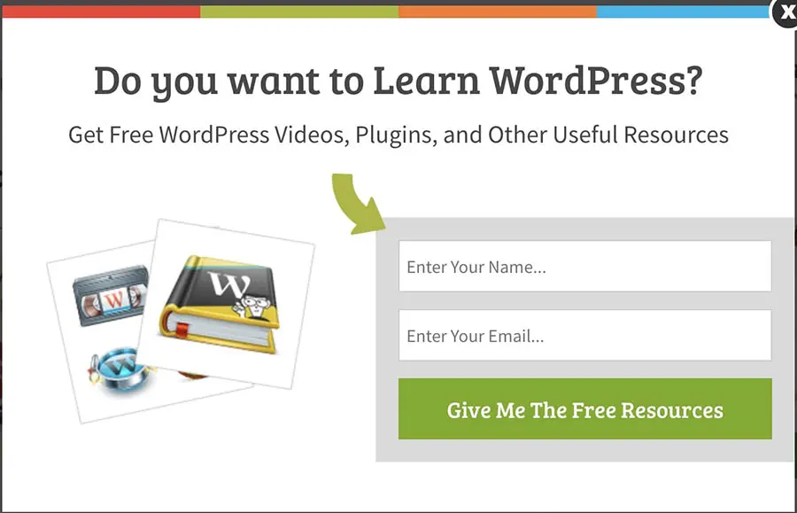
It’s important to distinguish CTAs on your site with contrasting colors, a unique form, or a timely pop-up. Additionally, never underestimate the power of white space.
You can also use your design to showcase value, emphasize scarcity, and encourage timeliness. In its CTA, the New York Times tells customers that they can receive a high-quality subscription for a fraction of the price:
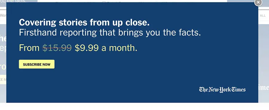
You’ll want to make the desired action look as enticing as possible. You can pair well-written copy with a thoughtful page design to achieve this.
Two things the five steps assume, and you shouldn’t: placement and measurement. Put the CTA where the decision actually happens: near the top for a simple, familiar offer, and right after the proof (testimonials, specs, pricing) for anything that takes more thought. Repeat it once at the end so readers who scrolled don’t have to scroll back. Then watch what it does. Track clicks and completed actions in your analytics, run one version against another over comparable traffic, and keep whichever the numbers prefer.
CTAs in writing: essays, proposals, and closing lines
A call to action in writing is the closing ask: the sentence that tells a reader what to do with what they just read. It does the same job as a button, minus the button. Ending a persuasive essay, a business proposal, a newsletter, or a pitch email? The pattern holds. Name one action, make it specific, and make it easy to say yes to.
Three rules carry most of the weight:
- One ask, not three. A conclusion that asks readers to donate, volunteer, and share the post splits their attention and usually gets none of it.
- Name the action and the deadline. “Email the school board before the March 4 vote” beats “we must all do our part,” which asks for nothing anyone can schedule.
- Shrink the next step. In a proposal, “reply with a 30-minute slot this week” is a much easier yes than “approve the full engagement.”
Here’s the same idea written for three different contexts:
- Persuasive essay: “If you want the creek cleaned up, say so at the April 9 council hearing. Five minutes of public comment moves this further than another shared petition.”
- Business proposal: “Approve phase one by May 1 and your new checkout goes live before the summer season. Reply to this email and I’ll send the contract today.”
- Blog post or email sign-off: “Pick one CTA on your homepage and rewrite it before you close this tab. Then tell us what changed.”
Notice that none of those lines mention a button. The medium changes; the ask doesn’t.
25 best call to action (CTA) examples to help you convert more visitors
Now that you’re familiar with CTAs, here are 25 of the best examples we found, with the pattern worth stealing from each one.
Browse by goal: ecommerce (3, 5, 9, 16, 22) · nonprofit and advocacy (6, 8, 23) · SaaS trials and demos (11, 15, 18, 19, 24) · streaming and media subscriptions (12, 14, 20, 25) · email and SMS signups (7, 10) · lead generation (4, 21) · multi-audience service pages (1, 2, 13, 17).
1. Grey Goose
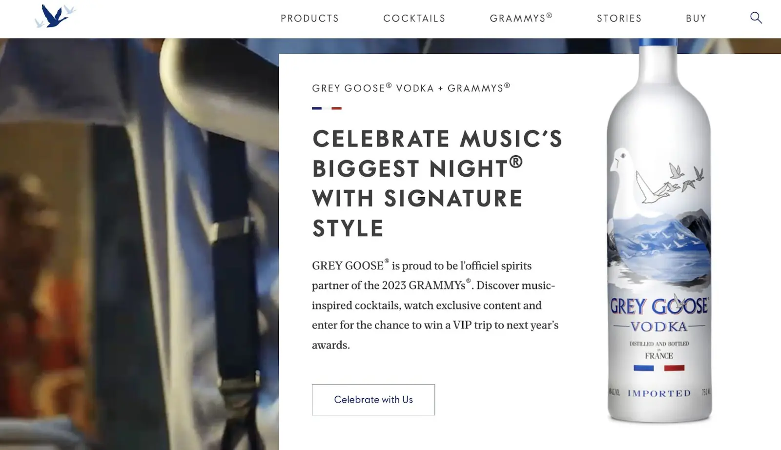
What makes this an effective call to action?
- Grey Goose asks visitors to ‘Celebrate with us’. This CTA uses personal pronouns to connect with the reader.
- The goal is to get users to enter a giveaway, which is low-risk.
- Grey Goose ran this giveaway CTA during the 2023 Grammys, aimed at everyone watching at home.
2. Uber
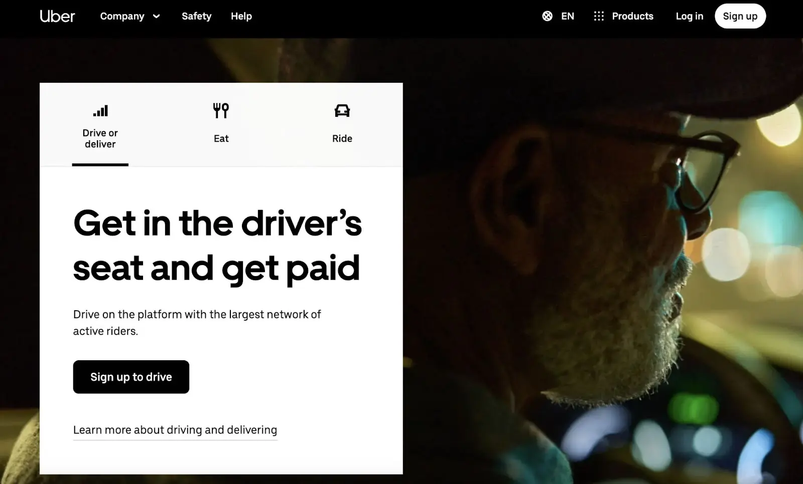
What makes this an effective call to action?
- Uber uses three different CTAs for specific users: drivers, riders, and people looking for food delivery.
- To recruit drivers, Uber states the main benefits of its rideshare program.
- There are simple calls to action like ‘Sign up to drive’, ‘Order now’, and ‘Request now’.
3. Brooks Running
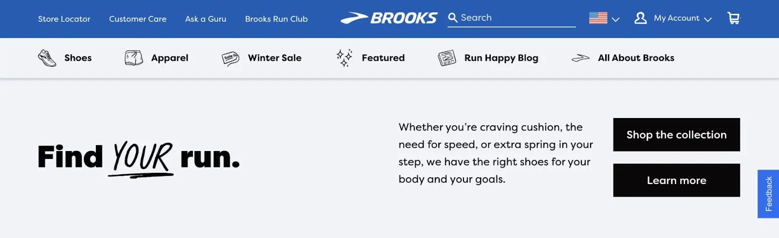
What makes this an effective call to action?
- Brooks Running personalizes its CTA by telling customers to ‘Find your run’.
- By clicking on the ‘Learn more’ button, visitors can learn which products are best for speed and comfort.
- Users can understand that Brooks Running has shoes for any type of body or personal goal.
4. Impact

What makes this an effective call to action?
- Rather than pushing people to buy its services immediately, Impact suggests that they talk with a sales advisor.
- Impact uses a bright orange CTA button that stands out from the rest of the website.
- The copy is personalized and targets business owners.
5. Touchland
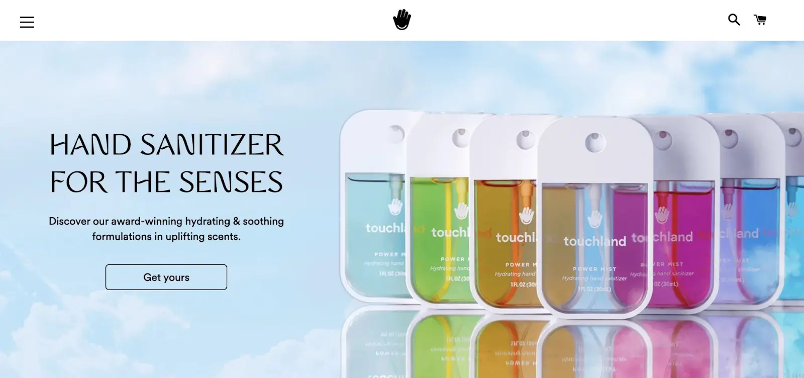
What makes this an effective call to action?
- ‘Get yours’ subtly suggests that customers will miss out if they don’t buy Touchland’s hand sanitizer.
- Since the product is a mist sanitizer, it makes sense that the web design is light and airy.
- Touchland informs the reader that its product will hydrate and soothe their skin, along with sanitizing it.
6. Panthera

What makes this an effective call to action?
- In this CTA, Panthera explains how a donation will preserve animal wildlife.
- Panthera makes it easy for online visitors to donate to its cause.
- Including an image of a tiger in its natural habitat adds an emotional appeal and encourages donations.
7. Madewell
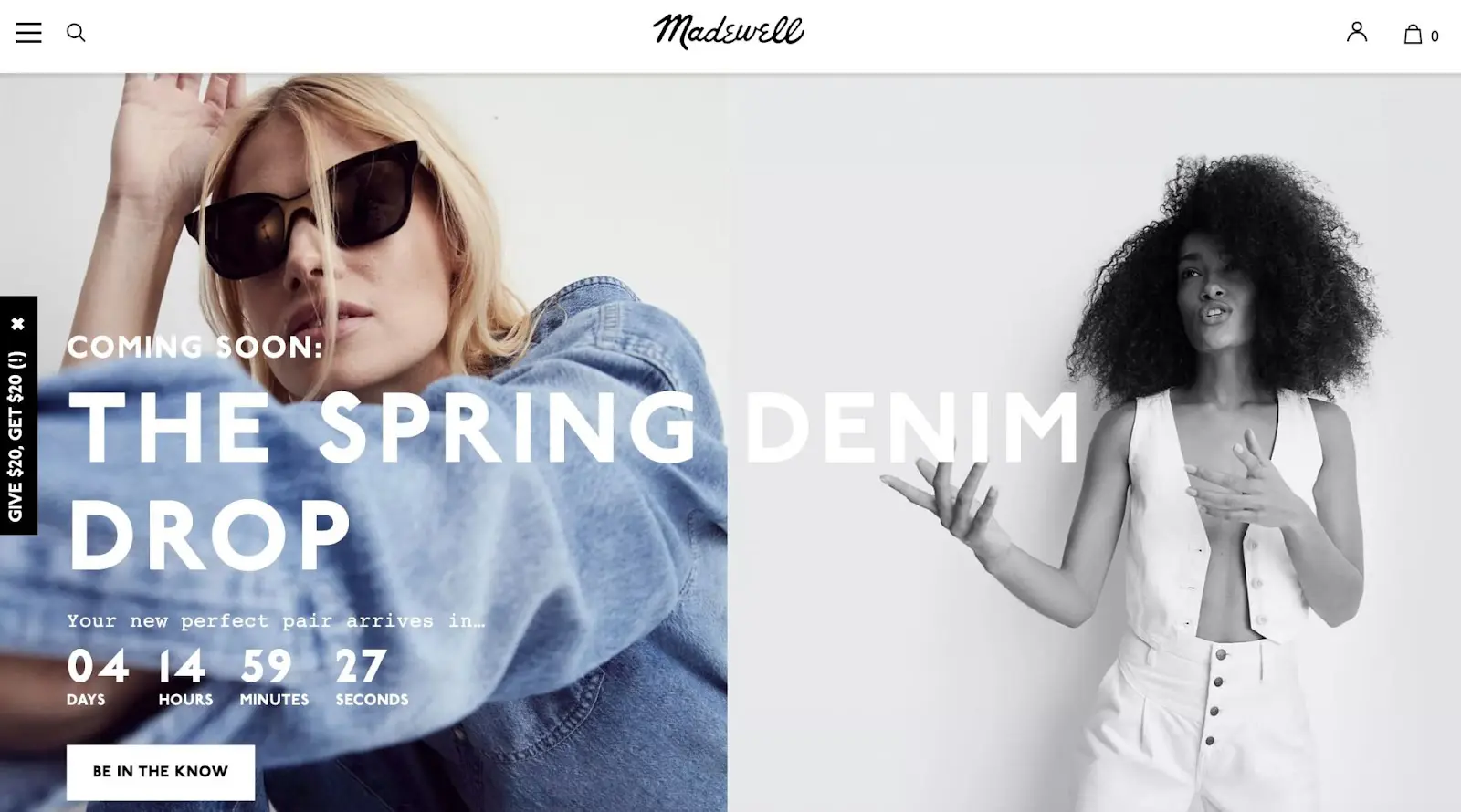
What makes this an effective call to action?
- Instead of making an immediate purchase, users can sign up for text alerts.
- Madewell motivates customers to ‘Be in the know’. This makes its new product drop seem more exclusive.
- Customers are likely to be intrigued about finding their ‘new perfect pair’ when shopping at Madewell.
8. Charity: Water
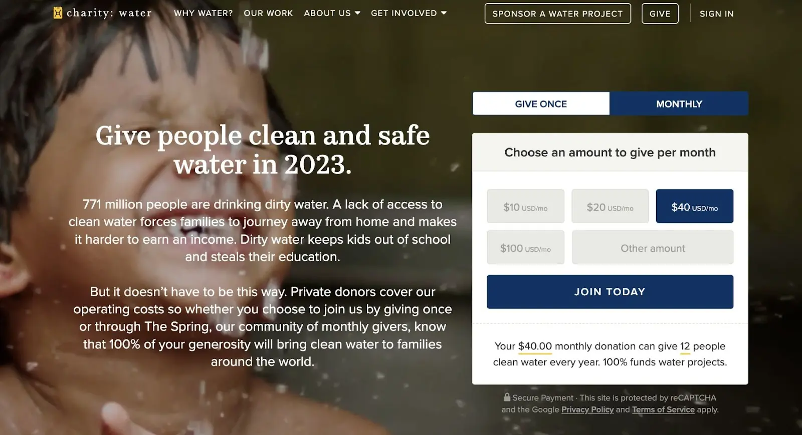
What makes this an effective call to action?
- This charity implies that donations can help change people’s lives.
- After clicking on a certain donation amount, Charity: Water calculates exactly how many people will be funded with your generosity.
- Visitors can also understand what will happen if they don’t donate.
9. BarkBox
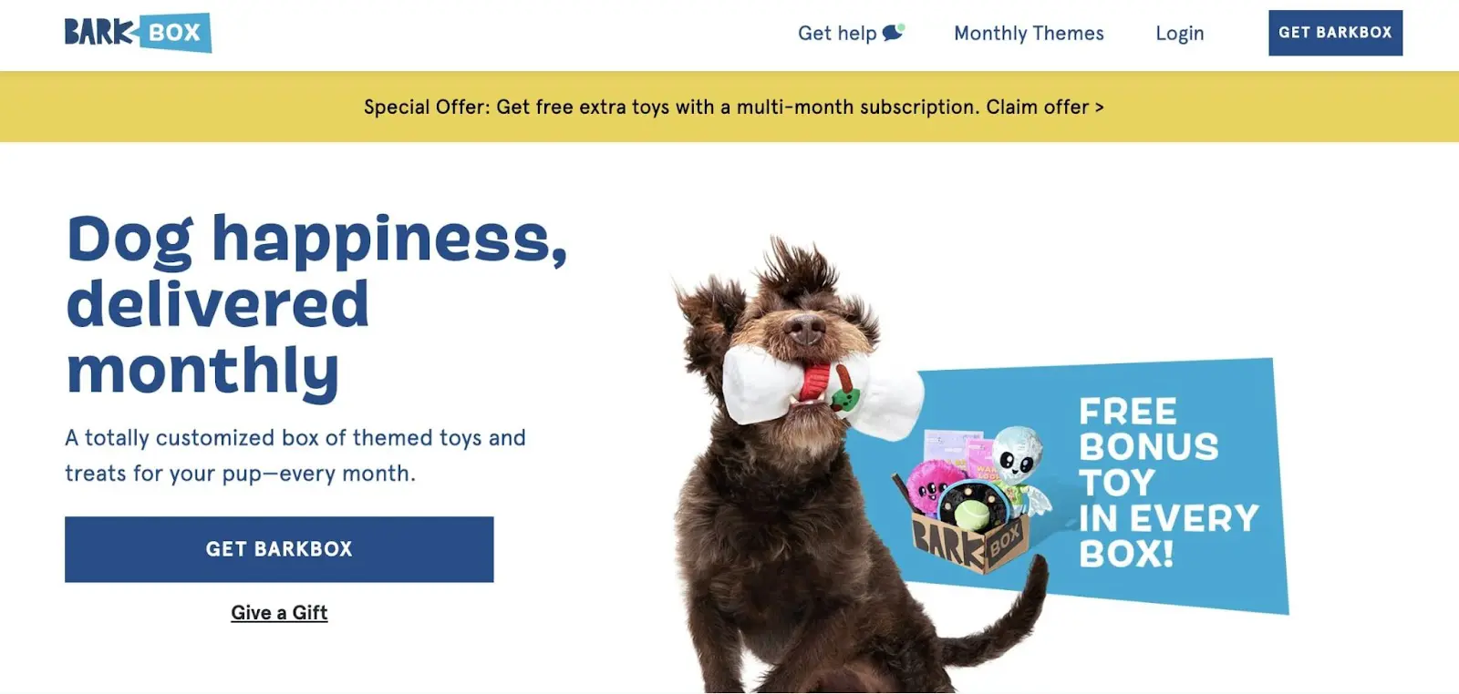
What makes this an effective call to action?
- BarkBox adds two CTAs for customers purchasing for their pets and people looking for a gift.
- No matter which option you choose, you’ll receive a custom box filled with pet treats and toys.
- BarkBox emphasizes how its boxes can make people’s dogs happy.
10. Joy
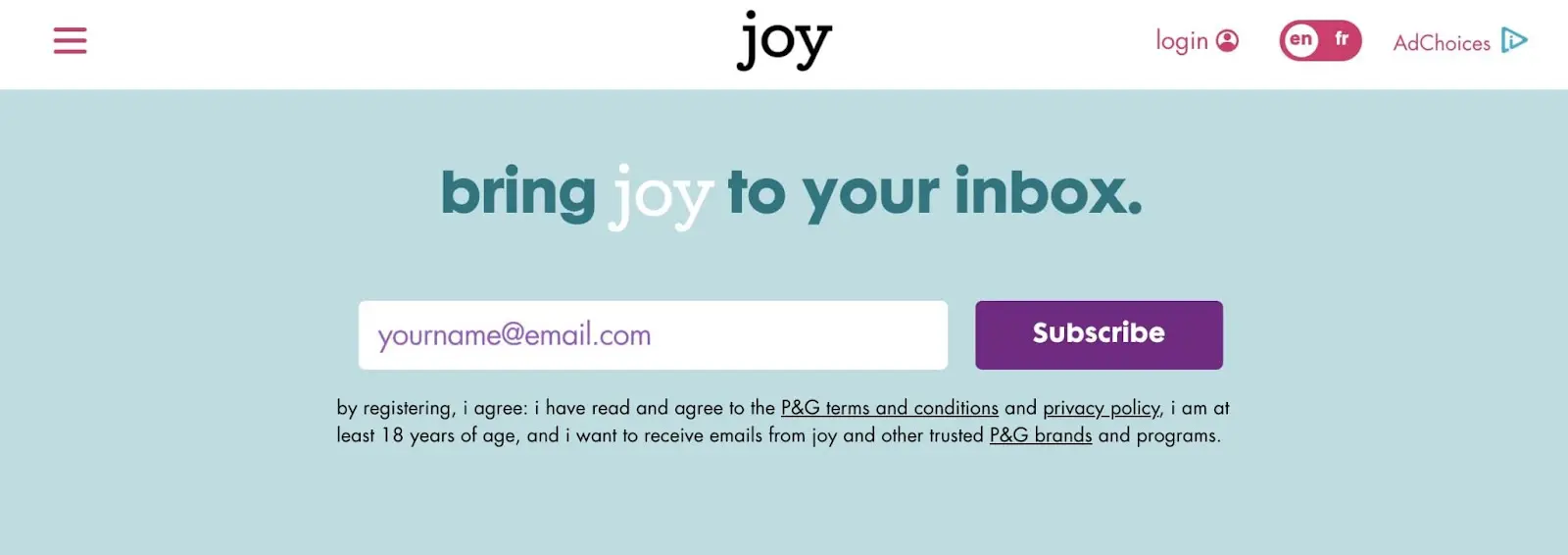
What makes this an effective call to action?
- With the line ‘Bring joy to your inbox’, this company incorporates its brand identity in the CTA.
- Rather than asking people to become customers, Joy offered a lower-stakes option: signing up for an email newsletter. (Joy’s standalone site has since been folded into Gillette Venus, so treat this one as an archive example.)
- The bright purple ‘Subscribe’ button tells visitors exactly what Joy wants them to do.
11. Mailwarm
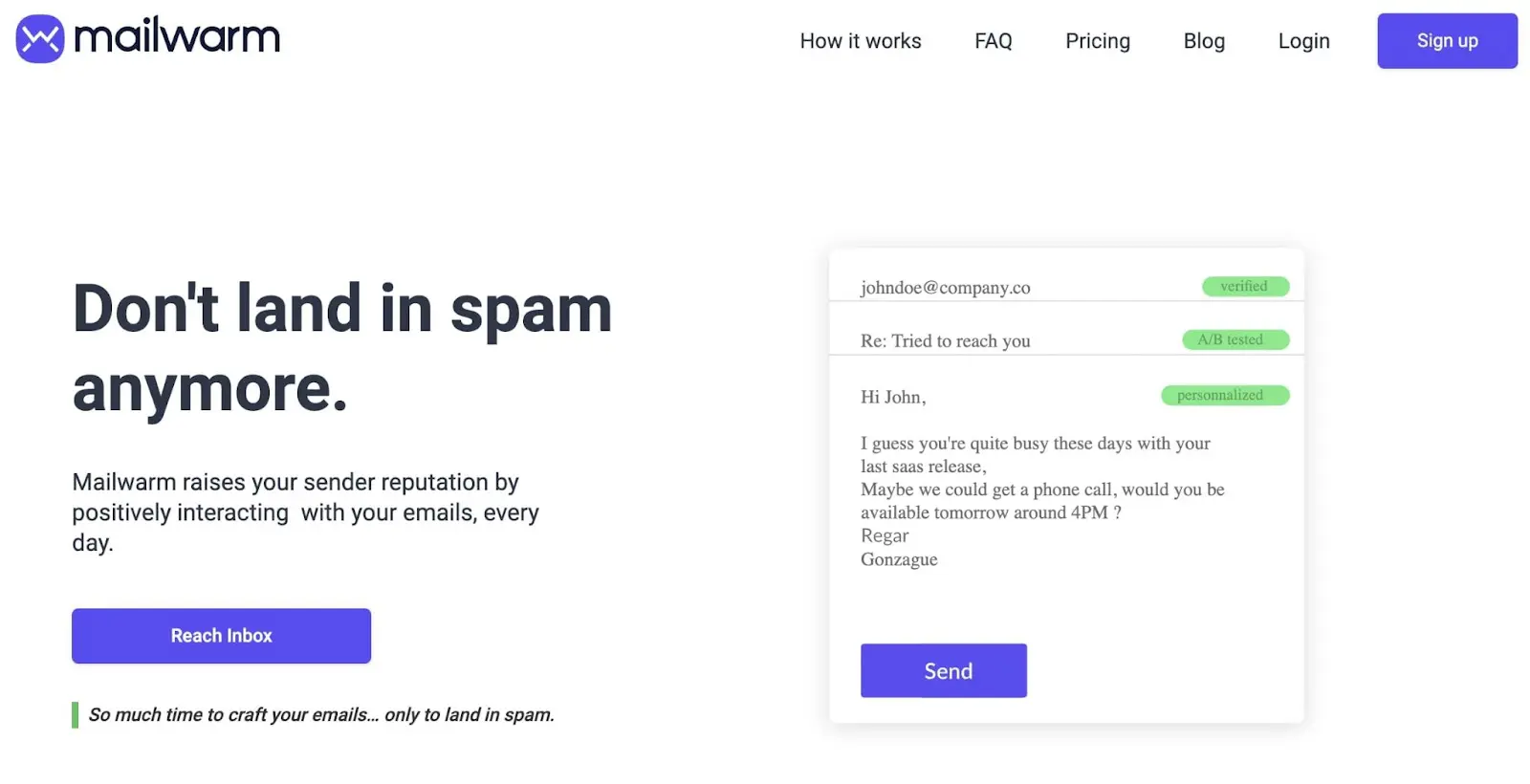
What makes this an effective call to action?
- Mailwarm promises to solve a problem for its potential customers. If you sign up, your emails won’t go to spam anymore.
- Visitors can see an animated demo of the software.
- Instead of adding a ‘Buy now’ button, Mailwarm tells users to ‘Reach inbox’. This is a less generic CTA with lower stakes for the customer.
12. Amazon Music
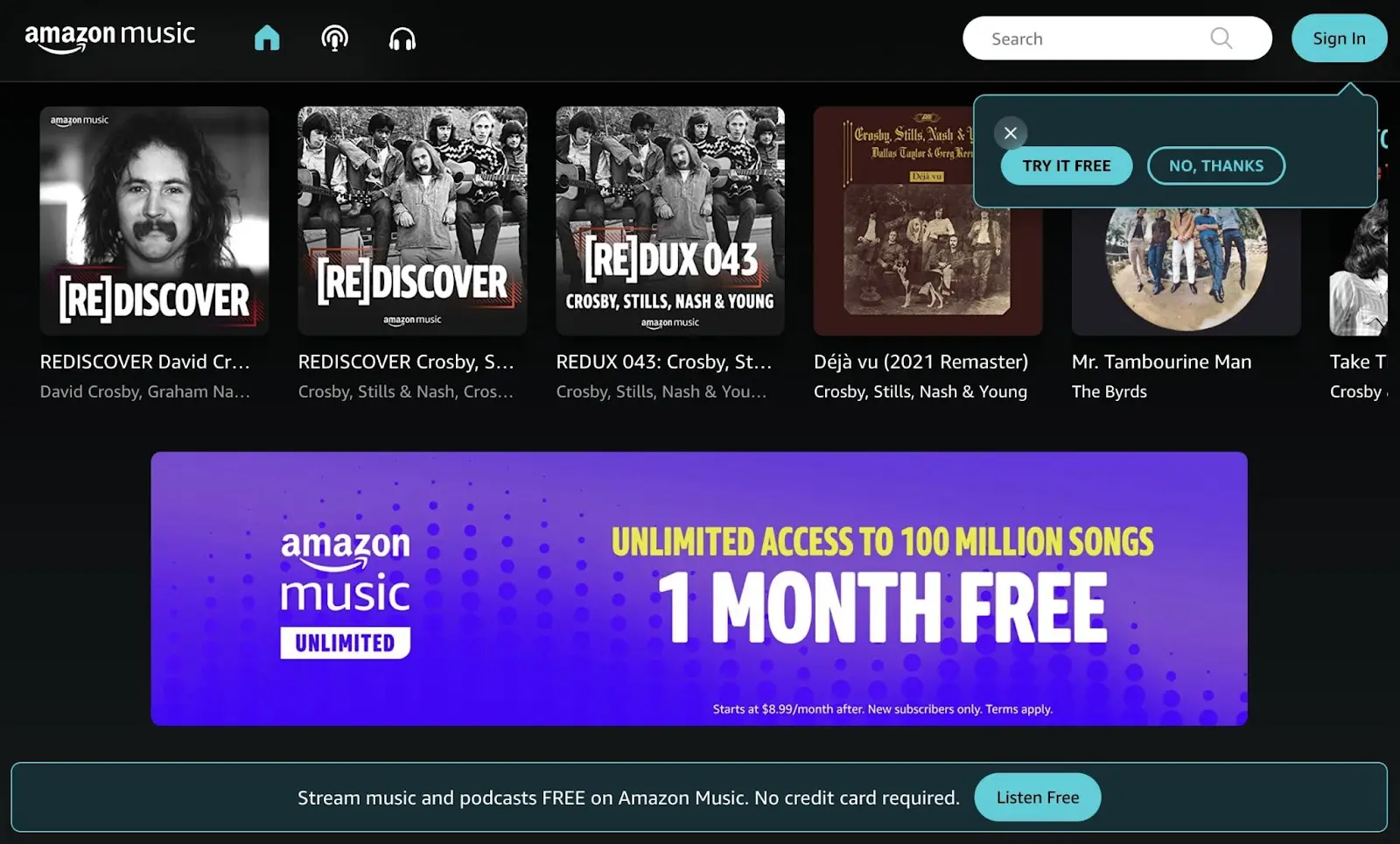
What makes this an effective call to action?
- Amazon Music uses two different CTAs at the top and bottom of the page.
- The company makes it clear that new customers can try Amazon Music for free.
- The free trial is what the page leads with, ahead of any pricing.
13. Khan Academy
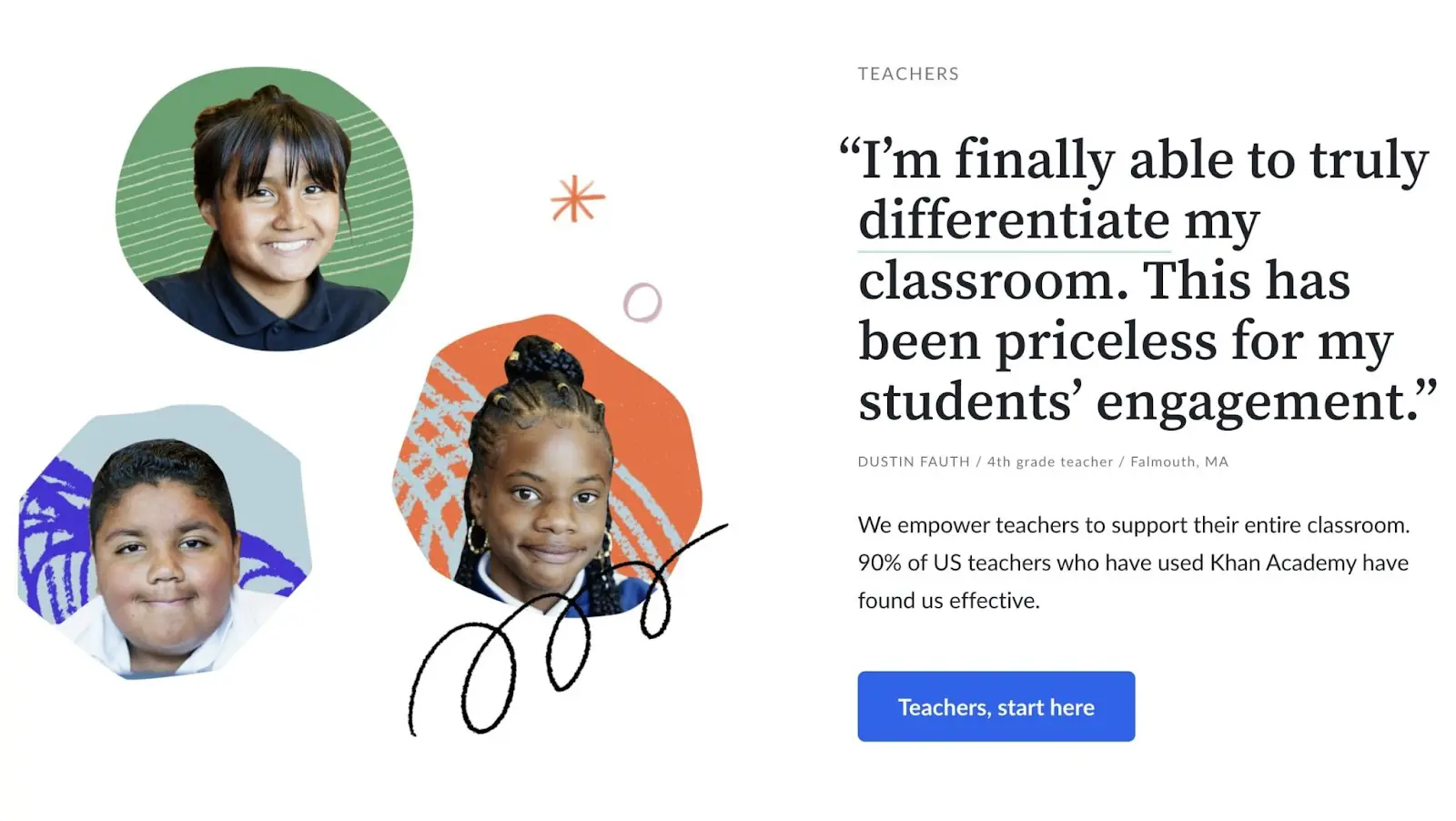
What makes this an effective call to action?
- Khan Academy provides services to districts, teachers, and students. For each target audience, it provides a ‘Start here’ button.
- New customers can see testimonials from other teachers.
- There are also plenty of statistics that explain Khan Academy’s effectiveness.
14. Netflix
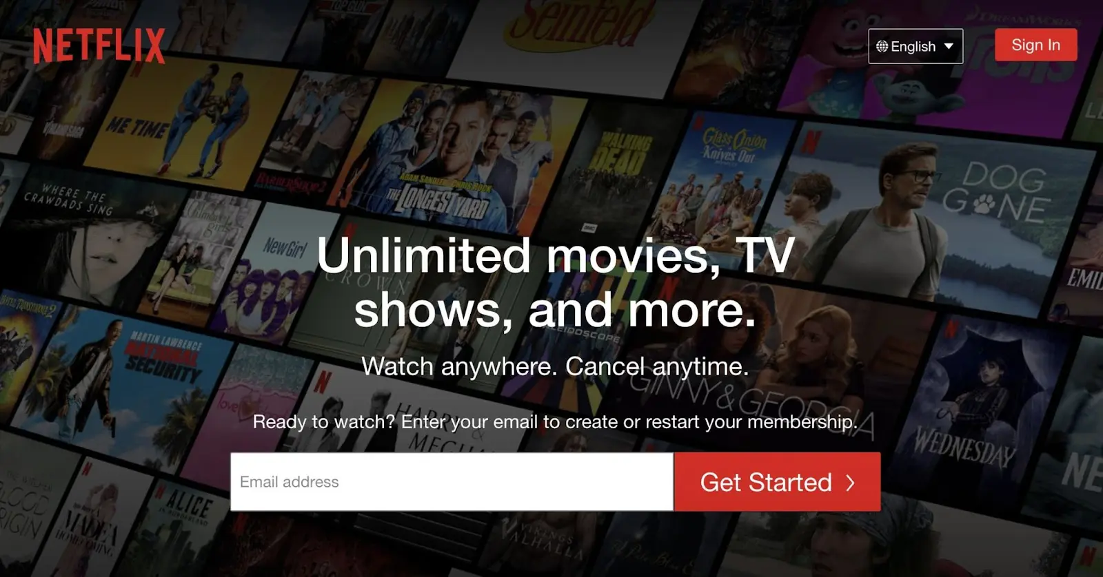
What makes this an effective call to action?
- Netflix explains that it offers unlimited media for all customers.
- Users can create a membership by hitting ‘Get Started’, but they can also easily cancel at any time.
- The background image displays just a few of the many TV shows and movies on Netflix.
15. Smartlook
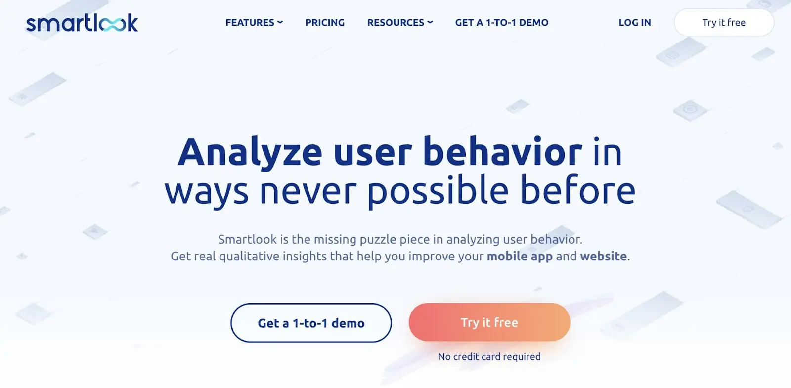
What makes this an effective call to action?
- Instead of pushing an immediate purchase, Smartlook offered a demo or free trial. Worth knowing: Smartlook is winding down, with no new subscriptions sold since May 31, 2026 and the platform decommissioned on September 30, 2027, per Smartlook’s End of Sale notice.
- Smartlook sums up its user behavior software in a few sentences.
- This CTA clearly targets anyone who owns a mobile app or website.
16. Hija De Tu Madre

What makes this an effective call to action?
- This CTA tells customers to ‘Shop for the best you’. This explains that Hija De Tu Madre’s products can improve a customer’s life.
- Hija De Tu Madre explains what its products were designed for.
- The pink CTA button contrasts well with the rest of the page design.
17. Booking.com
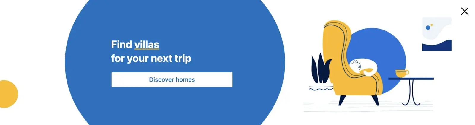
What makes this an effective call to action?
- Booking.com explains that it can provide a place to stay for people on vacation.
- The animated text shows customers that they can find apartments, villas, condo hotels, and houses.
- Users can click on ‘Discover homes’ to start browsing vacation rentals.
18. Dropbox
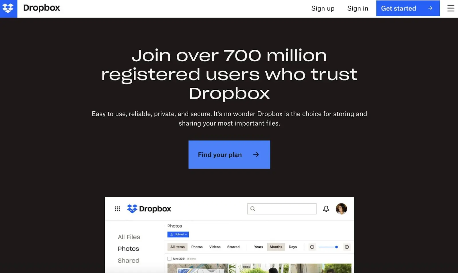
What makes this an effective call to action?
- Since Dropbox lists its high number of registered users, this motivates new visitors to sign up.
- The ‘Find your plan’ CTA implies that Dropbox has a wide variety of subscription options for different use cases.
- Dropbox also makes sure to concisely explain the benefits of using its software.
19. Evernote
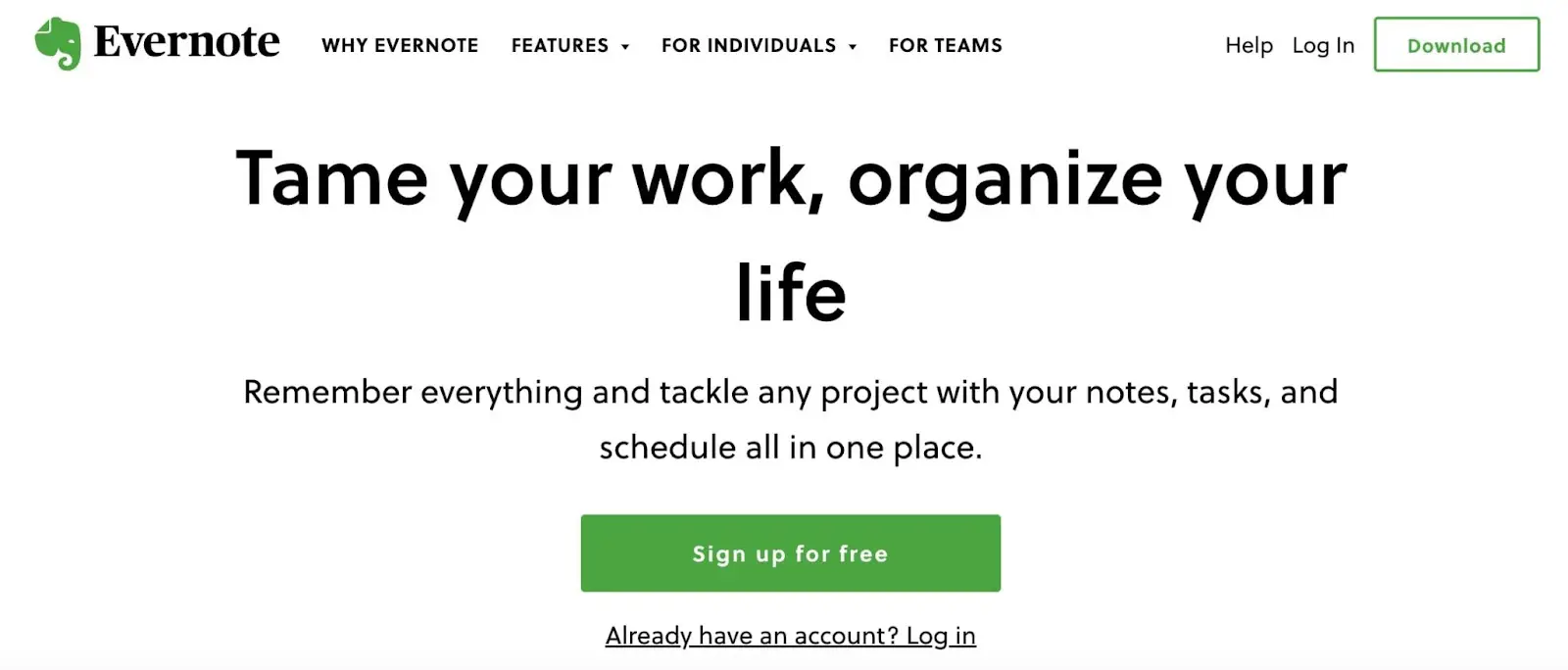
What makes this an effective call to action?
- Like other options on this list, Evernote prompts users to try its product for free.
- Visitors can understand exactly how Evernote can improve both their work and personal lives.
- The web design is simple, highlighting the bright action buttons.
20. Hulu
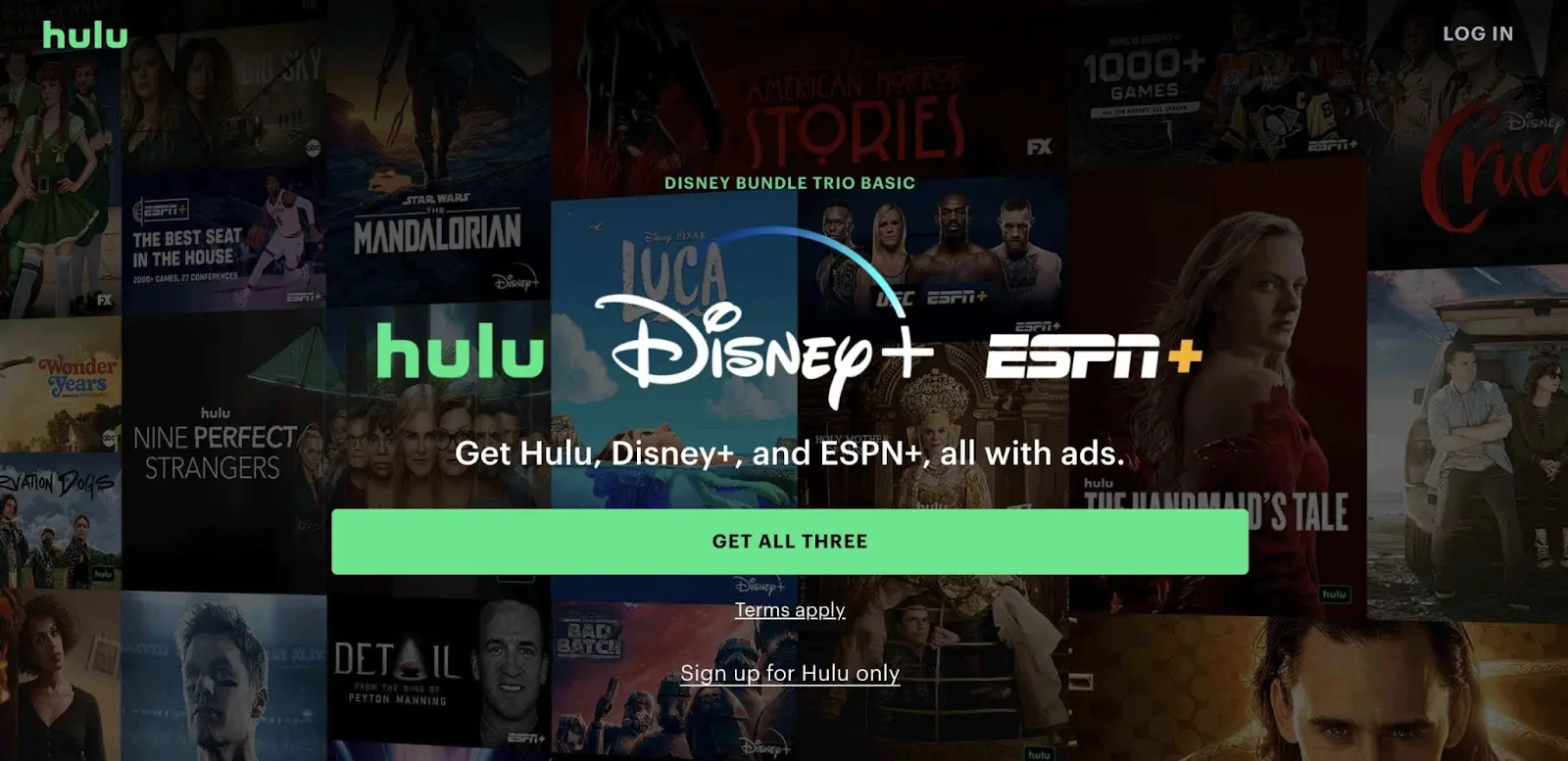
What makes this an effective call to action?
- People usually don’t just want one streaming service, so Hulu pitched a bundle with Disney+ and ESPN. Since then Disney has been folding Hulu into Disney+, announced in August 2025, though a standalone Hulu subscription is still sold in the US (TVInsider, May 2026).
- The CTA ‘Get all three’ tells customers that they can have it all.
- Alternatively, customers can also sign up for Hulu only.
21. The Budgetnista
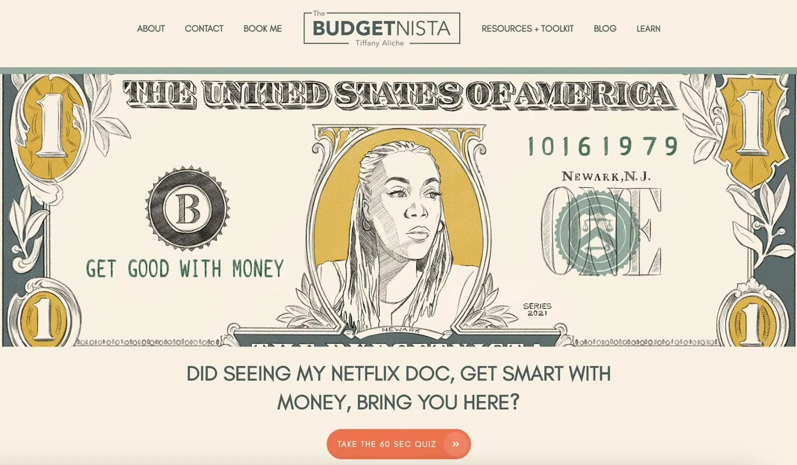
What makes this an effective call to action?
- If someone wants to improve their finances, they can take the Budgetnista’s quiz.
- This CTA explains that the quiz will only take 60 seconds. This encourages visitors to quickly take it.
- The copy speaks directly to first-timers looking for financial guidance.
22. 4Ocean
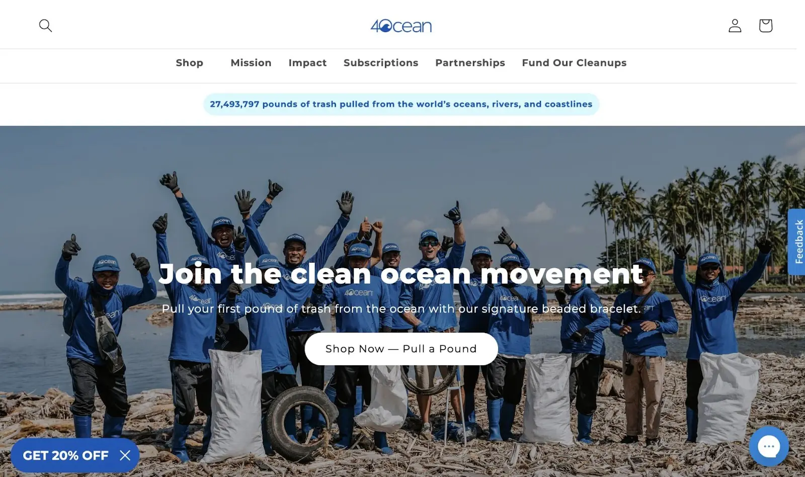
What makes this an effective call to action?
- 4Ocean uses the CTA ‘Shop now – Pull a pound’. This tells environmentally conscious shoppers that every purchase removes a pound of trash from the ocean.
- The content slider displays different products you can buy to help clean up the environment.
- Rather than marketing itself as a business, 4Ocean urges customers to join its movement.
23. Patagonia
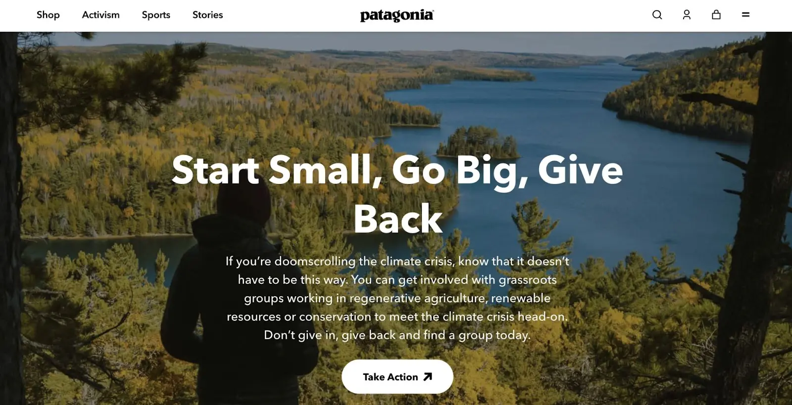
What makes this an effective call to action?
- Patagonia is another environmentally friendly brand that encourages visitors to ‘take action’ against climate change.
- The company gives a positive alternative to doom-scrolling and uncertainty.
- Visitors can find links to petitions, events, and volunteer opportunities for environmental activism.
24. Trello
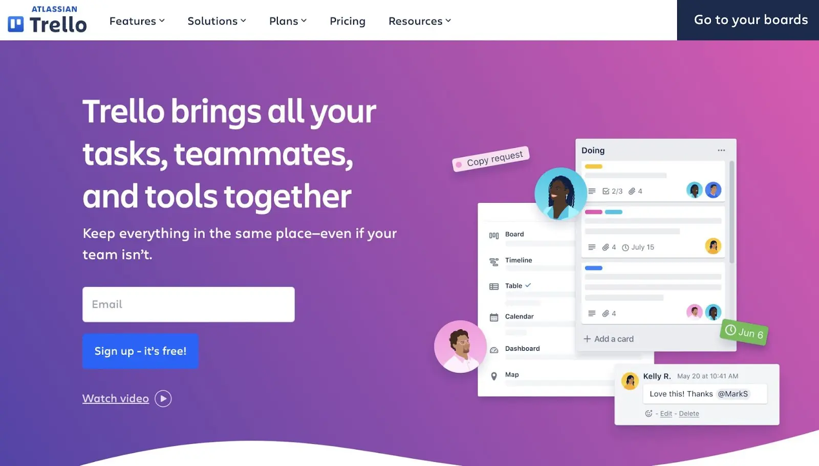
What makes this an effective call to action?
- Trello explains how its software can help remote teams work together more efficiently.
- New customers don’t have to buy the product right away.
- Instead of asking for too much information, Trello only requires an email address to sign up.
25. Headspace
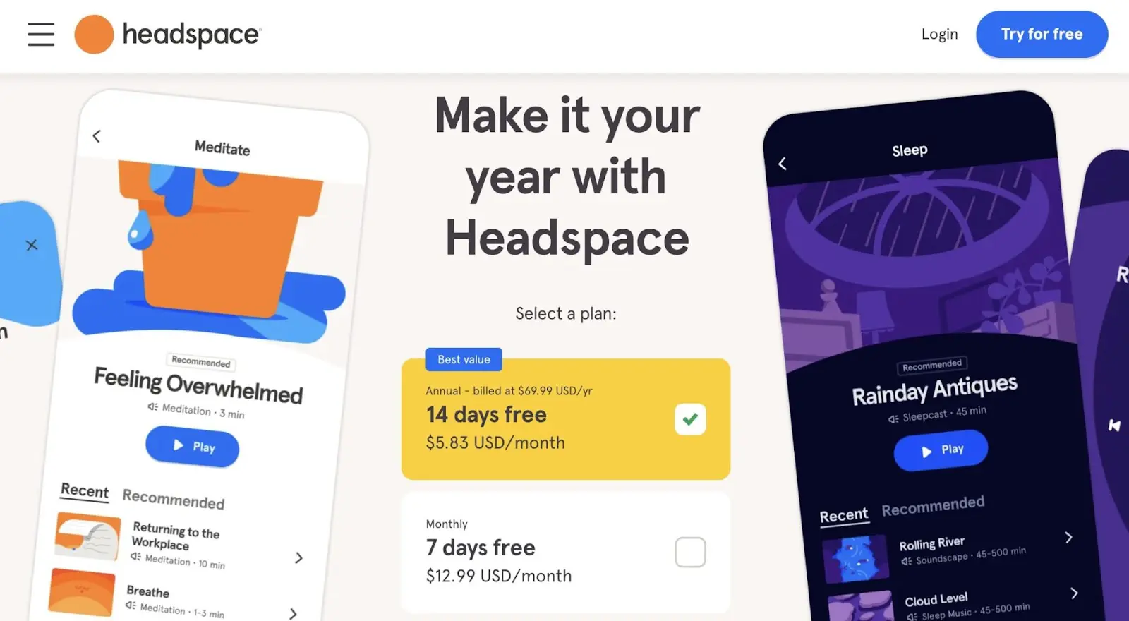
What makes this an effective call to action?
- This CTA eliminates any unnecessary information, by providing image demos of its meditation app.
- The company tells users that it can help ‘make it your year’.
- New customers can experiment with a free trial before committing to a subscription.
Call to action FAQs
What is a call to action in writing?
It’s the closing ask in a piece of writing: the sentence that tells a reader what to do next. In an essay that might be “email your council member before the vote.” Same job as a button on a web page, delivered in prose.
How do you write a call to action?
Five steps: decide what action you want, pick the audience it’s for, write it in plain benefit-led words, lower the risk (a free trial, an easy opt-out), and design it to stand out. Then test one version against another and keep the winner.
How long should a call to action be?
Short enough to read at a glance. Most of the buttons in the 25 examples above run two to five words (“Get yours,” “Find your run,” “Get all three”), and an in-text CTA rarely needs more than a sentence. If it doesn’t fit on the button, cut it.
What’s a good call to action for an essay conclusion?
One specific, doable action with a time or place attached. “Comment at the April 9 hearing” lands; “we must all do our part” doesn’t. Say who acts, what they do, and when, then stop writing.
How do you write a call to action in a business proposal?
Ask for the smallest next step, not the whole contract. “Reply with a 30-minute slot this week” or “approve phase one by May 1” gives the reader a decision they can make today, and the date does the nudging for you.
Encourage action
To get people to take action on your website, you need a magnetic invitation! Smart copy and design contribute to an effective call to action and enthusiastic response.
To review, here’s how to write an effective call to action:
Are you struggling to write a call to action for your website? DreamHost Pro Services can write and test it for you.

Get More Visitors, Grow Your Business
DreamHost Pro Services marketing experts will help you earn more traffic and convert more website visitors so you can focus on running your business.
Learn More
Did you enjoy this article?
