Mobile Checkout Optimization: 11 Highest-Impact Fixes


Mobile checkouts have an abandonment problem.
You’ve seen the stats: DynamicYield’s April 2026 benchmark data puts 74% of ecommerce traffic on phones, but mobile cart abandonment runs at 81.72% — roughly 11 percentage points above desktop.
Sure, mobile shoppers behave differently from desktop shoppers. More browsing, less purchase intent.
But many don’t convert because of the poor checkout experience or design.
This article covers 11 mobile checkout best practices that will help you fix this. I will also show you how to find where your checkout leaks and find the root causes with Crazy Egg.
11 High-Impact Mobile Checkout Fixes
The 11 mobile checkout optimization practices cover page design, payment, form structure, performance, and continuity.
Fix 1: Design for the mobile screen and the thumb
When designing the checkout, make sure the visitor sees the essential element clearly on the mobile screen and can easily navigate it with their thumb while holding the phone in the same hand.
In practice, this means:
- Single-column design. Multi-column form sections require horizontal scrolling.
- Tap targets at least 44×44pt with at least 8px of spacing (Apple’s iOS Human Interface Guidelines)
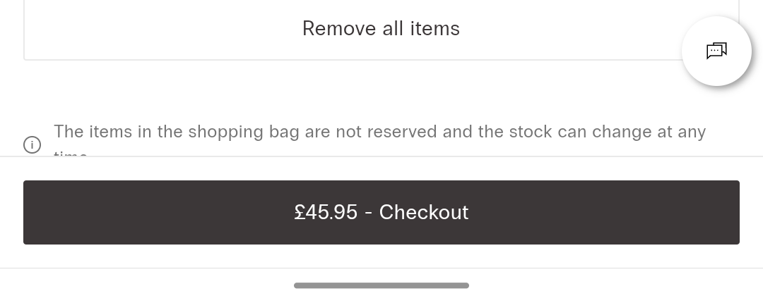
- Sticky full-width primary CTA button at the bottom of the viewport to keep the primary action easy to reach at all times.
- Specific CTA copy (“Pay $42.98”, not “Continue”).
When testing your mobile checkout design, do it from Instagram and TikTok in-app browsers, too. These browsers render the page differently from Safari and Chrome, and UI elements can get clipped.
Fix 2: Don’t lose sleep over single-page or multi-page checkout flow design
Contrary to popular belief, single-page checkouts don’t convert better than multi-page ones.
They’re less likely to break when clicking between pages, and the buyer has everything on one page. But they also require more scrolling up and down to find the information, and can be overwhelming.
If you go with one page, use the accordion-style design to keep the user focused on one task at a time.
Multi-page checkout, on the other hand, immediately captures the customer’s email (first step), so you can re-engage them even when they don’t complete the purchase, and you can logically organize the process without overloading the user.
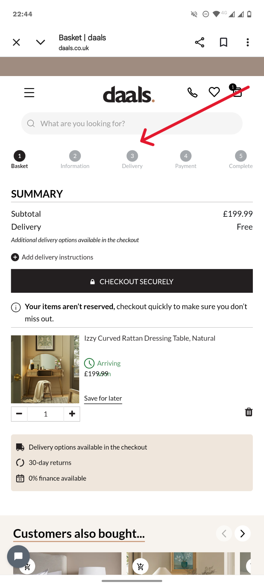
If that sounds like your thing, add a progress indicator bar so your customers know exactly how many more steps they have left.
Whichever design you choose, keep it clean and simple.
Remove everything that would distract the buyer or make them navigate away from the page.
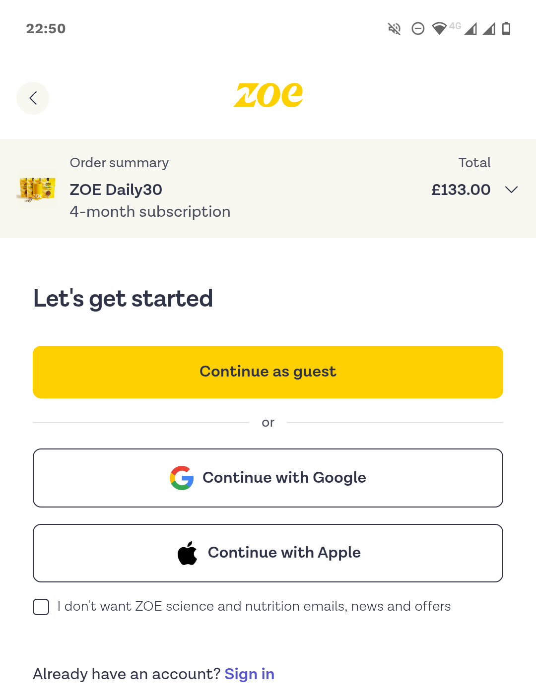
Fix 3: Make guest checkout the default and use SSO
Forced account creation is responsible for 19% of cart abandonments because it creates unnecessary friction that slows the purchase, which is particularly painful — and relevant — on mobile devices.
When you add guest checkout to your checkout process, make it the most prominent option. A full-width primary button at the start of checkout.
Hiding it beneath the login form or a small text link makes it hard to find for mobile users.
It doesn’t mean you have to get rid of the “create an account” option. Just leave it for the confirmation step, when the customer has already swiped their card.
Single sign-on (SSO) enables users to log in with their existing social credentials. Google, Apple, Facebook, the lot. This shortens registration and translates into higher conversions. By 20-40%, according to various estimates.
Fix 4: Lead with digital wallets
Adding digital wallets, like Apple Pay, Google Pay, PayPal, or Shop Pay, at the top of the checkout form increases conversions and revenue.
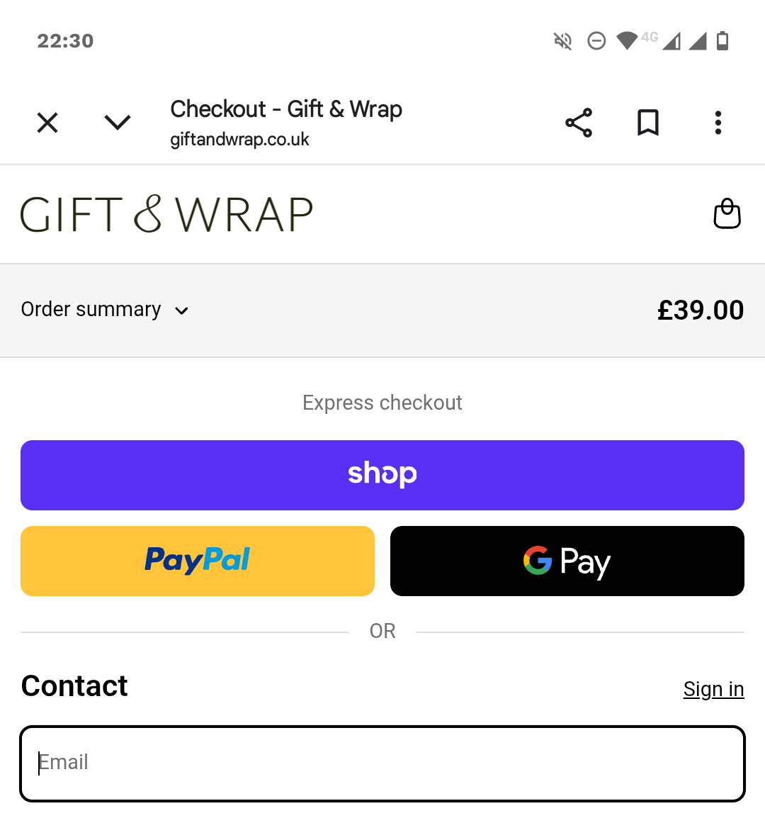
In April 2025, Stripe found that adding Apple Pay boosted conversion by 22.3% among eligible checkouts and revenue by 22.5%. Shopify cites another study from April 2023 that showed Shop Pay increased conversions by up to 50% compared to guest checkouts.
There are three reasons:
- It increases user trust. The logos increase the buyer confidence, and they’re not sharing payment details with you directly.
- It eliminates the risk that the credit card is declined, which accounted for 10% of cart abandonments in 2025.
- It simplifies and speeds up the checkout process. Especially when combined with biometric authentication like FaceID or TouchID. The customer doesn’t need to complete the form or enter credit card details. Too long or complex checkout flows were the reason for 18% of cart abandonments in the Baymard study cited above.
Offer the payment methods that your customers actually use. Stripe’s data showed localized wallets driving outsized conversion in their home markets — iDEAL in the Netherlands (+39%), Alipay in China (+91%), BLIK in Poland (+46%).
Fix 5: Add BNPL for mid-value orders
Buy now, pay later (BNPL) options, like Klarna, Clearpay, or AfterPay, increase conversion rates and the average order value (AOV), resulting in a 14% revenue lift, according to Stripe (June 2024). Klarna case studies show even higher AOV lifts.
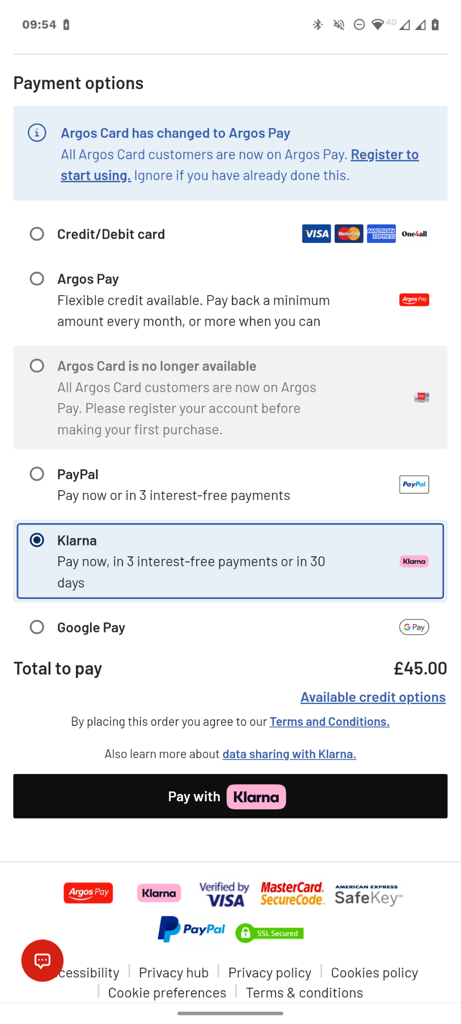
Just like digital wallets, BNPL speeds up the transaction. But, more importantly, it changes the purchase economics. By reducing the immediate financial strain, it lets the customer say yes to a larger order.
The impact varies depending on the purchase value. The sweetspot is $100-500, and still works up to $1,500-2000.
Processors cap the purchase value there, and for higher ticket items, customers prefer other financing options, like monthly payments over 12-36 months. And they don’t make such purchases on mobile.
Fix 6: Place trust signals close to the checkout button
As mentioned, digital wallets increase customer trust. This matters because, according to Baymard, 19% of shoppers abandoned carts because they didn’t trust the site with their card details.
How else can you boost their confidence?
- Add “Secure checkout” microcopy and a padlock icon

- Add credit card and payment processor logos
- Name the payment processor visibly (“Payments by Stripe” or “Secured by PayPal”)
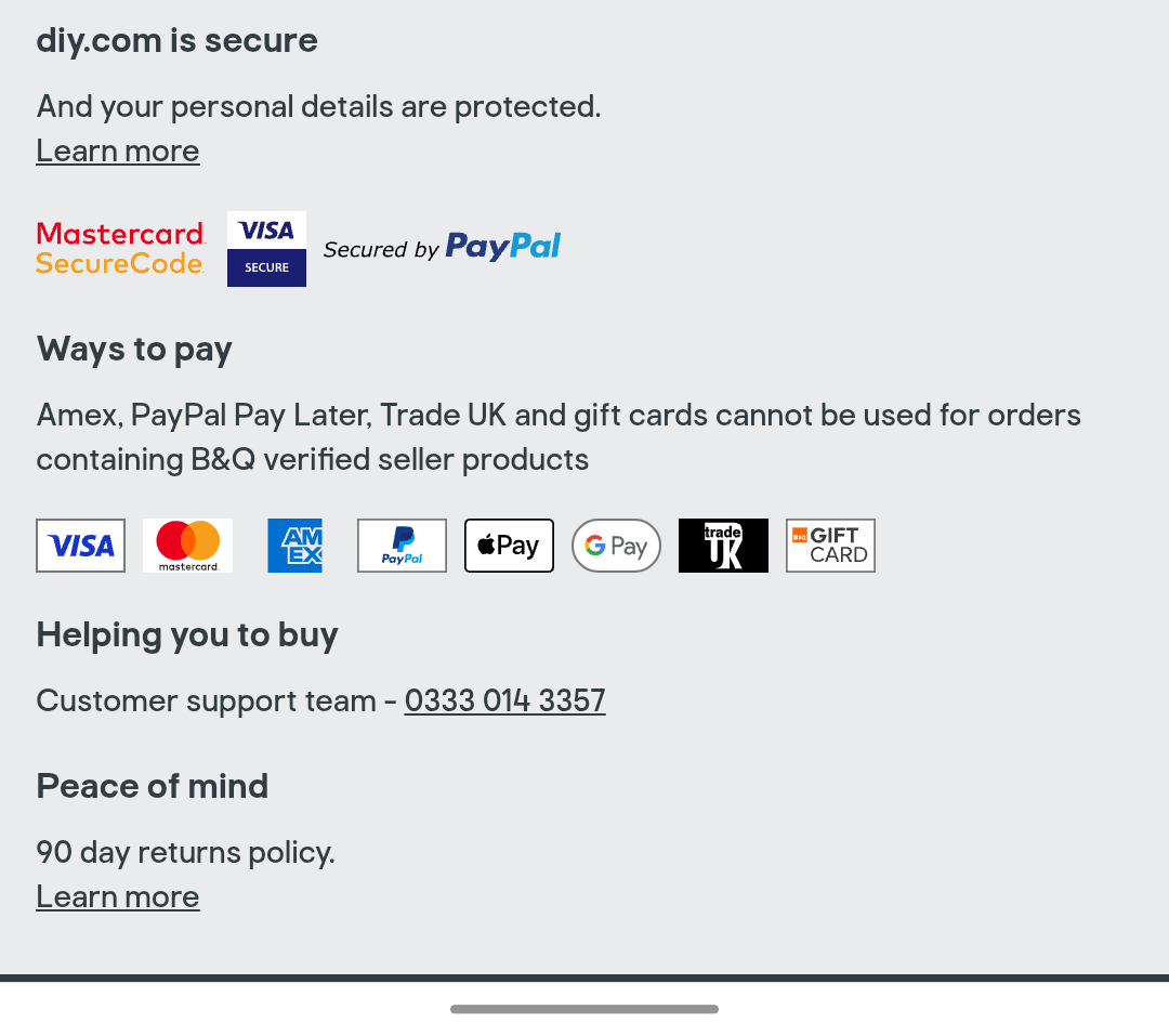
- Enable 3D Secure / SCA bank-issued auth (required in the EU/UK)
Place the key safety signals close to the payment button. Otherwise, customers won’t see them on the small mobile screen.
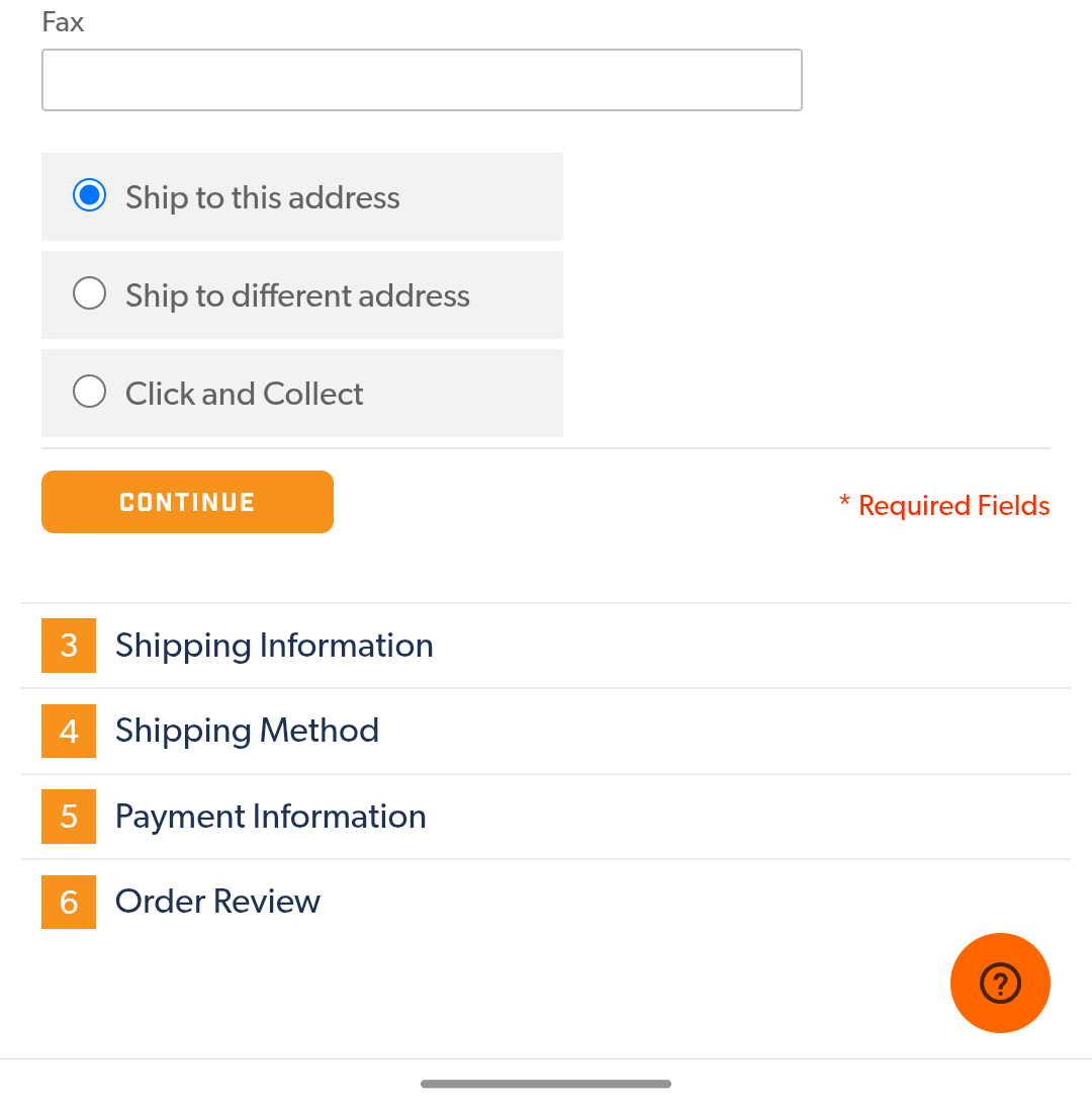
Fix 7: Cut form fields to the optimal minimum
Not all customers use digital wallets, so your mobile checkout page needs a form. Your job is to reduce the number of fields to a minimum to eliminate distractions and remove friction.
What’s the right field number?
For a B2C checkout, that’s 6-8.
And yet, the average checkout form had 11.3 fields in 2024, according to Baymard.
So what are the common fields you can get rid of?
- Address Line 2
- Billing address fields — default to shipping address and hide it in the accordion tab or on a separate screen.
- Coupon fields (Hide it behind a link or auto-fill it for sitewide discounts)
- Phone number — email is enough for updates
- Separate first and last name fields (shipping companies normally prefer them like that, so your hands might be tied here).
- Company
- Date of birth
Fix 8: Make the forms easy to complete
There’s a limit to how far you can strip your checkout form fields, but there are things you can do to make them easier to complete.
Here are a few solutions that will help your customers sail through them:
- Automatic address finder — the customer starts typing the address, and once it appears on the screen, a tap populates all the address fields.
- Autocomplete — by enabling it on the form and setting the parameters correctly, you let the customer complete fields with information stored in their browser/operating system.
- Automatic keyboard detection — setting the right HTML attributes (type=”tel”, type=”text”, inputmode=”numeric”, etc.) means the customer doesn’t toggle between text and numerical keyboards to complete different field forms.
- Saved customer details — for the returning customers with existing accounts.
- Right field and input types — radio buttons and drop-downs remove friction, but only if the options are clearly visible on the mobile screen. For long lists, typed input with autocomplete is quicker and easier.
- Inline validation — positive confirmation when the customer completes the form correctly, or a specific error message when they make a mistake as they type, saves the frustration of having to go back and look for errors after they hit “Pay” and nothing happens.
All these may improve the mobile checkout experience and reduce cart abandonment more than stripping the field numbers or reducing checkout steps. Baymard’s findings show that effort matters more than count or length. Four fields that each require complex typing can feel worse than 12 fields with autofill and the right keyboard.
Fix 9: Improve page load times and technical stability
Slow page load times and technical instability kill checkout completions.
Mobile connections are slower than broadband networks, and mobile users tend to be less patient, so if the page load time exceeds 2-3 seconds, they might not hang around.
To optimize your checkout speed,
- Defer non-critical JavaScript; lazy-load below-the-fold images.
- Audit third-party scripts on the checkout page. Pixels, A/B testing tools, loyalty widgets add up.
- Pre-load checkout assets when the shopper adds the first item to the cart.
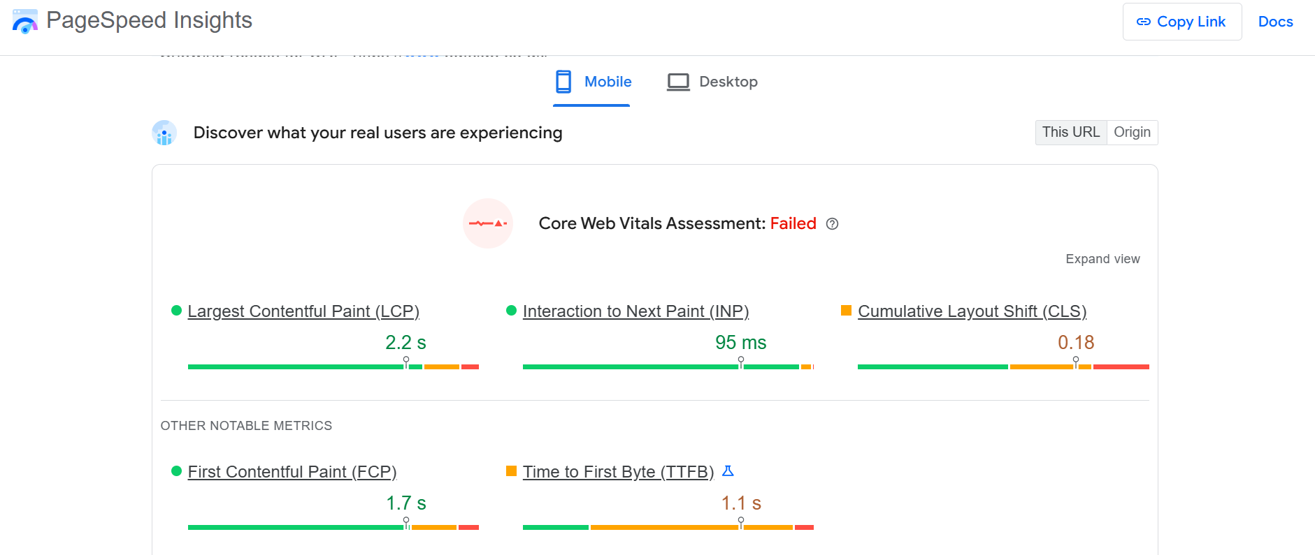
- Run checkout through Google PageSpeed Insights in simulated mobile mode
Poor page stability is equally bad for business. 15% of the surveyed by Baymard abandoned their carts because the “website had errors or crashed.” That’s more than due to not having enough payment options or having the card declined.
To improve checkout page stability,
- Track JavaScript errors specifically on the checkout flow.
- Watch for re-render bugs in single-page-app (SPA) checkouts that wipe form state when the cart or shipping address updates.
- Catch payment-iframe load failures (Stripe Elements, Adyen, Braintree) with a fallback path — usually a digital wallet — instead of leaving the customer staring at a blank card field.
Fix 10: Save cart state for cross-device completion
For some product categories, like furniture, B2B, vehicles, or designer apparel, shoppers start their journey on mobile, but complete the purchase on desktop. Saving the cart state makes the transition smooth.
For this to work, you need to identify the user, for example, through their email address, an existing logged-in account, a loyalty program ID, or a social login.
Traditionally, you get these at checkout, but this doesn’t work when someone places the item in the cart and leaves before making it to checkout.
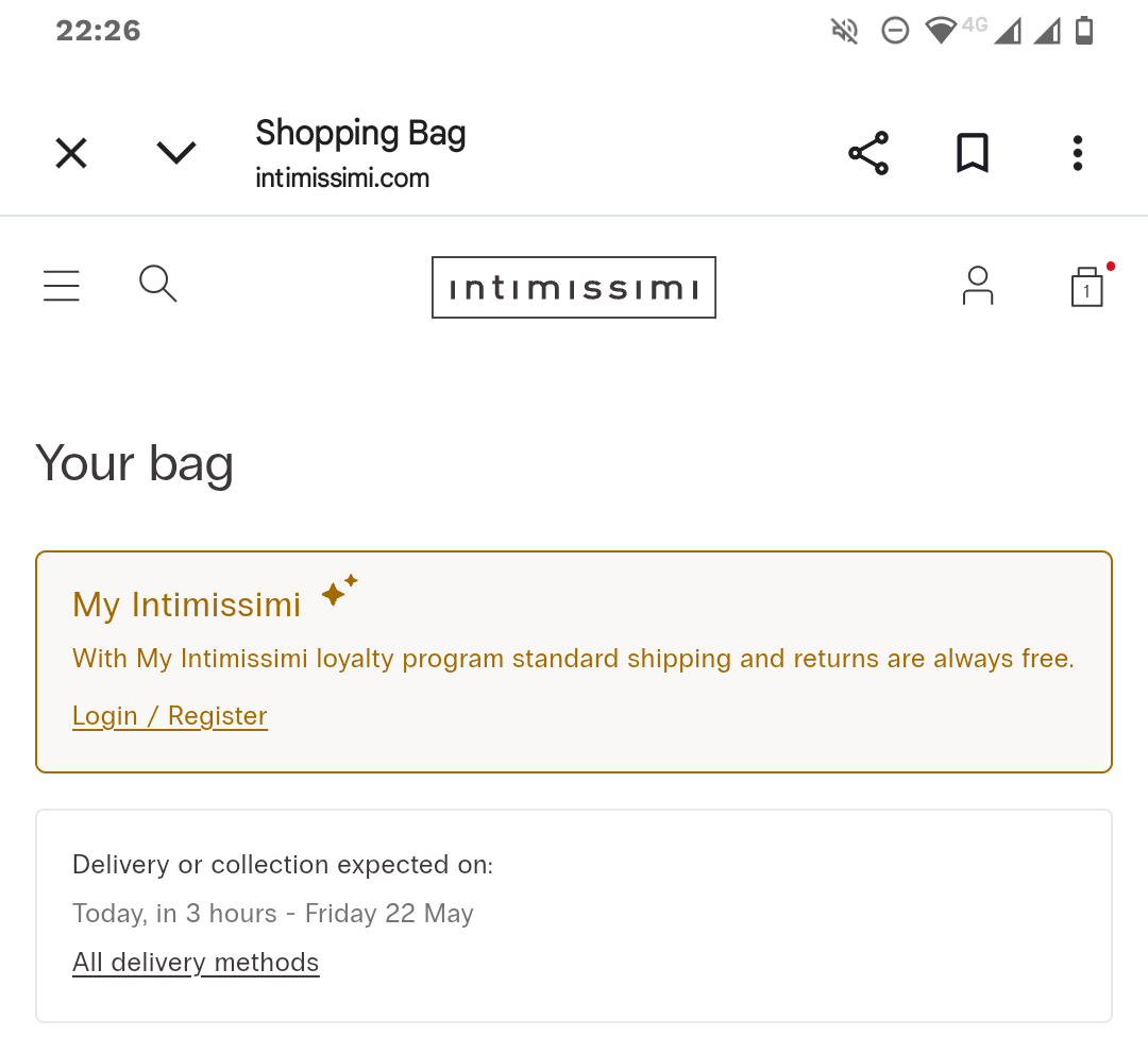
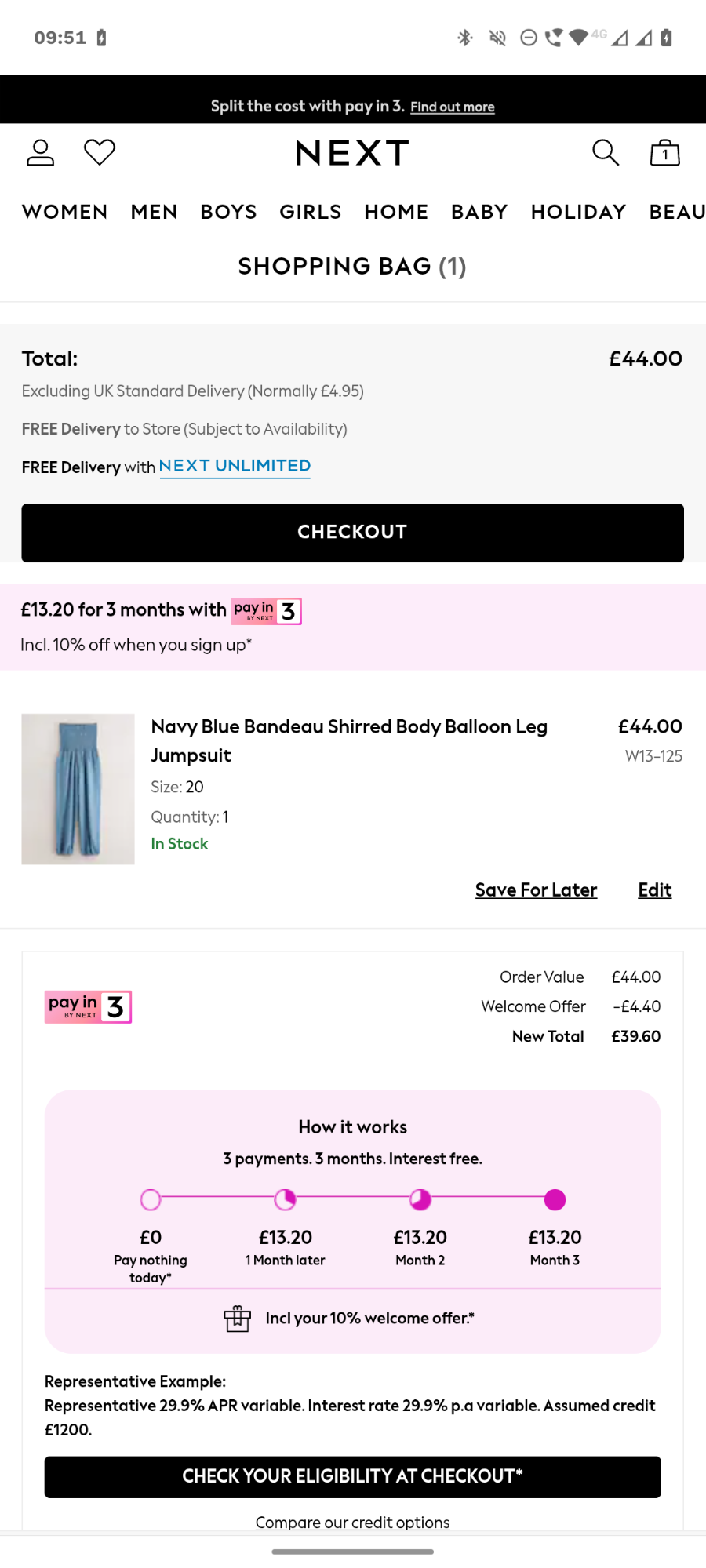
You want to get it before, like Next, which encourages you to install their mobile app, or Intimissimi, through their loyalty program perks.
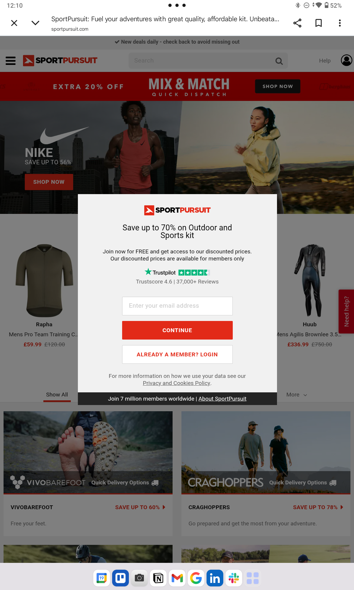
Some retailers, like SportPursuit, won’t even let you browse without registering or signing in, but you can get away with this only when your products or pricing are exceptionally good.
The moment one of those exists, your server creates a record: this email or account has this cart, with these items, at this state. And updates that record on every cart change.
Your e-commerce platform will handle this for you. For example. Shopify and WooCommerce persist cart and saved details across devices for any signed-in customer.
With that in place, the customer will see the items in their cart when they log back in – from the same or a different device.
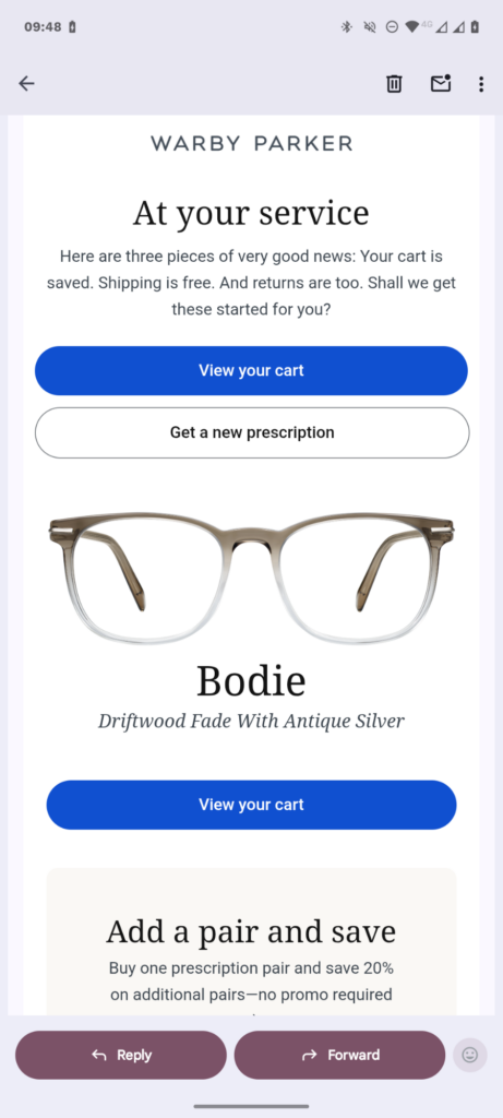
And if they don’t, you can bring them back with “you left this in your cart” emails.
Fix 11: Show costs early and keep the order summary visible
Displaying the full order price upfront clearly is the single biggest fix you can implement to improve checkout completion rates.
Too high extra costs, like shipping, and not being able to see the total order cost upfront are the two most common card drop-off causes, accounting for 39% and 14% of all cart abandonments, respectively.
The only reason I didn’t include it higher up is that it isn’t purely a checkout optimization but more a product page and cart optimization tactic.
So, here’s what to do:
- Render a geolocation-driven estimate of the estimated tax and shipping costs on the product page. Display it on the cart page, too.
- Avoid late-stage surprise fees — service charges, handling, anything that shows up only at the final tap.
- Keep the order summary expandable on tap, with the running total in the default state/country, at the top of every checkout step.
The challenge with mobile devices is that you have less real estate in the viewport to display the information.
How to use Crazy Egg to optimize mobile checkout experience
Optimizing your mobile checkout starts with a diagnosis: where customers drop off and why.
Crazy Egg’s analytics and user behavior tracking tools answer these questions:
- Funnels map the checkout journey step-by-step — cart, shipping, payment, confirmation — and show you exactly which step has the biggest drop-off.
- Click maps show where mobile users tap on your checkout page, scroll maps reveal what they see and what they don’t, and confetti reports segment the data by operating system and traffic source.
- Session recordings let you watch real abandonment as it happens.
- Error tracking surfaces JavaScript errors.
- Surveys capture customer feedback with exit-intent or post-purchase prompts, like “What stopped you from completing your purchase?” or “How would you rate your checkout experience?”
- A/B Testing lets you validate a fix before rolling it out site-wide.
Sounds interesting? The free plan covers Web Analytics, Surveys, Conversion Analytics, and Instant Heatmaps, and you can try out all Crazy Egg features for 30 days for free. No credit card required!
Frequently asked questions
What’s a good mobile checkout conversion rate?
What counts as “good” mobile checkout conversion rate depends on your industry. For example, the average conversion rate for Beauty & Personal Care in April 2026 was 4.24%. At the other end of the spectrum, Home & Furniture products had only 1.07%.
How does B2B mobile checkout differ from B2C?
B2B mobile checkout tends to be more complex and requires more information. Things you don’t find in B2C but are common in B2B checkouts include PO number fields, multi-approval workflows, larger AOVs, saved carts for repeat orders, and contract-pricing visibility.
This means adjusting the best practices accordingly. For example, guest checkouts may not be suitable, and your forms will have more fields.
What’s a good cart-recovery email sequence for mobile abandoners?
A typical sequence is three emails sent across 48–72 hours. Klaviyo recommends a 2-4, 24, and 48 -hour sequence, while Shopify recommends 1, 24, and 72 hours after drop-off.
The final email may include some extra incentive, like free shipping or a discount, but use this with caution, not to teach your customers to abandon their carts for this very reason.

