
30 Best Newspaper & News Website Designs 2026
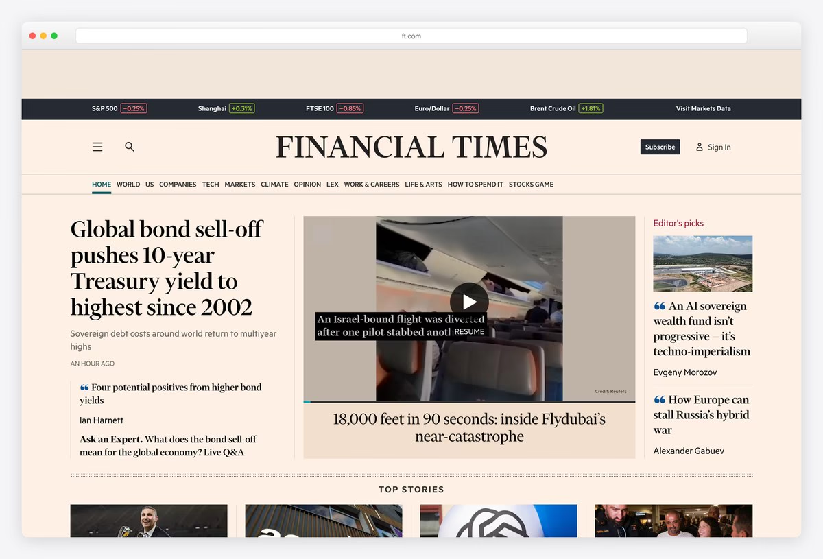

The best newspaper websites keep the clear hierarchy of a printed front page (one lead story, ranked headlines, recognisable sections) and add what print cannot: live data, video and navigation that follows the reader. These 30 news website designs range from the world’s biggest papers to small independent newsrooms, and for each one we list the platform it runs on and the typeface its headlines use. If you are building your own, our news WordPress themes are a good place to start.
We opened each site in a real browser and read the platform from the files it loads and the typefaces from the page itself. Eight of the 30 run on Next.js, seven on WordPress, and twenty set their headlines in a named, often custom, typeface, which says a lot about how much news brands invest in type.
Newspaper Websites
Daily papers that carry a print front page onto the screen, from New York and Washington to Zürich, Paris and Geneva.
1. The New York Times
Built with: Custom code
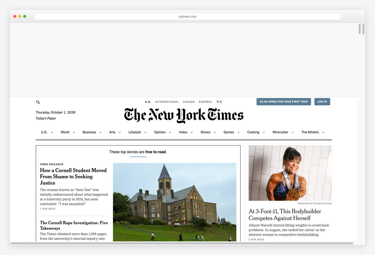
The New York Times keeps the homepage of a printed broadsheet: the blackletter masthead centred over a row of section links, a dense multi-column grid below it, and a lead package that mixes a large photograph with smaller headlines stacked beside it.
What makes it work online is restraint. Sections are separated by thin rules rather than boxes, headline sizes do the ranking, and photography is cropped consistently, so a page with dozens of stories still reads as one front page. A short label over the lead stories notes which ones are free to read, which keeps the subscription prompt honest.
What stands out: A print front page translated to the screen without losing its hierarchy.
2. The Washington Post
Built with: Arc XP, Next.js · headlines in Postoni
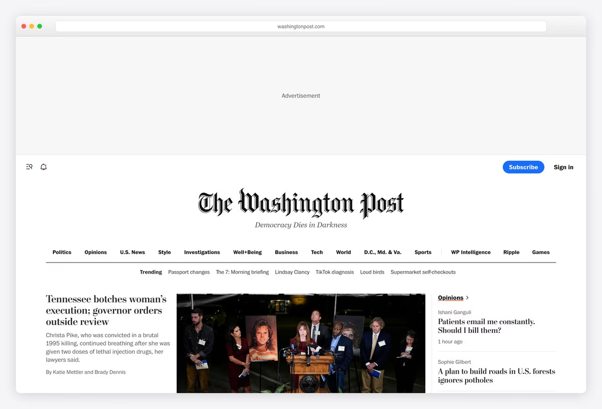
The Washington Post sets its blackletter nameplate and the line “Democracy Dies in Darkness” over a long row of sections, with a Trending strip of short topic links underneath for readers who want today’s stories rather than departments.
The front page itself is a classic three-column grid with headlines in Postoni, the Post’s own serif, over a sans body text. Under the hood it runs on Arc XP, the publishing platform the Post built in house and now sells to other newsrooms, with a Next.js front end.
What stands out: A newspaper that built its own publishing platform, and it shows in the consistency.
3. The Guardian
Built with: Custom code · headlines in GH Guardian Headline
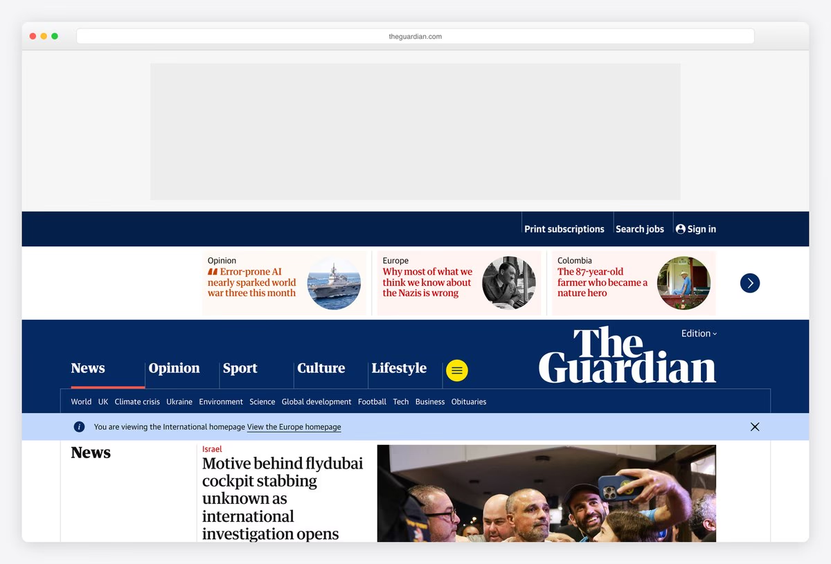
The Guardian’s front is built in colour-coded containers: a deep blue masthead with the wordmark, then horizontal bands of stories where each section has its own accent colour, so news, opinion, sport and culture can be told apart at a glance.
Headlines are set in Guardian Headline, part of the paper’s own type family, and opinion pieces carry the writer’s photo. It is a clear example of a design system doing the editorial work: readers learn the colours once and can then scan any page of the site.
What stands out: Colour-coded sections that readers learn once and use everywhere.
4. Financial Times
Built with: Custom code · headlines in Financier Display
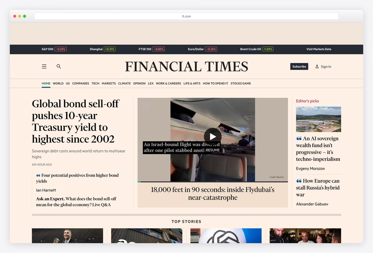
The Financial Times is recognisable from across the room thanks to its salmon-pink background, carried over from the printed paper. A strip of live market data (indices, currencies, oil) runs across the top of the page before the navigation even starts.
Headlines are set in Financier Display, a serif drawn for the FT, and the lead story pairs a short standfirst with an image or video. The page is built for readers who scan for markets first and stories second, and the layout reflects that order.
What stands out: A brand colour so strong it works as a logo.
5. Los Angeles Times
Built with: Brightspot
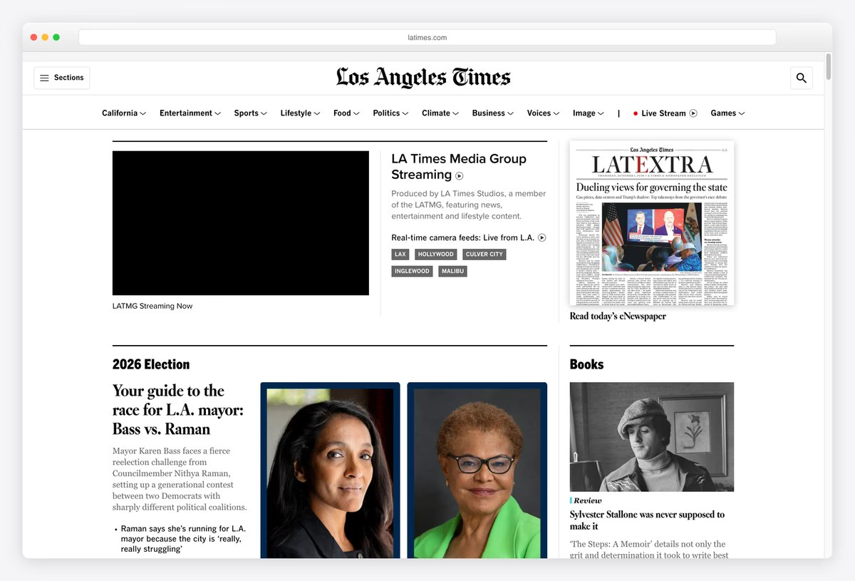
The Los Angeles Times puts local life at the top: a live stream from its media group, real-time camera feeds from places such as LAX and Hollywood, and a link to read today’s eNewspaper next to the lead stories.
Below that, a tight grid of sections covers California, entertainment, food and sports, each with its own label. The site runs on Brightspot, a content platform used by several large newsrooms, which helps explain how many content types share one consistent page.
What stands out: A regional paper that leads with live, local video.
6. BBC News
Built with: Next.js · headlines in BBC Reith Serif
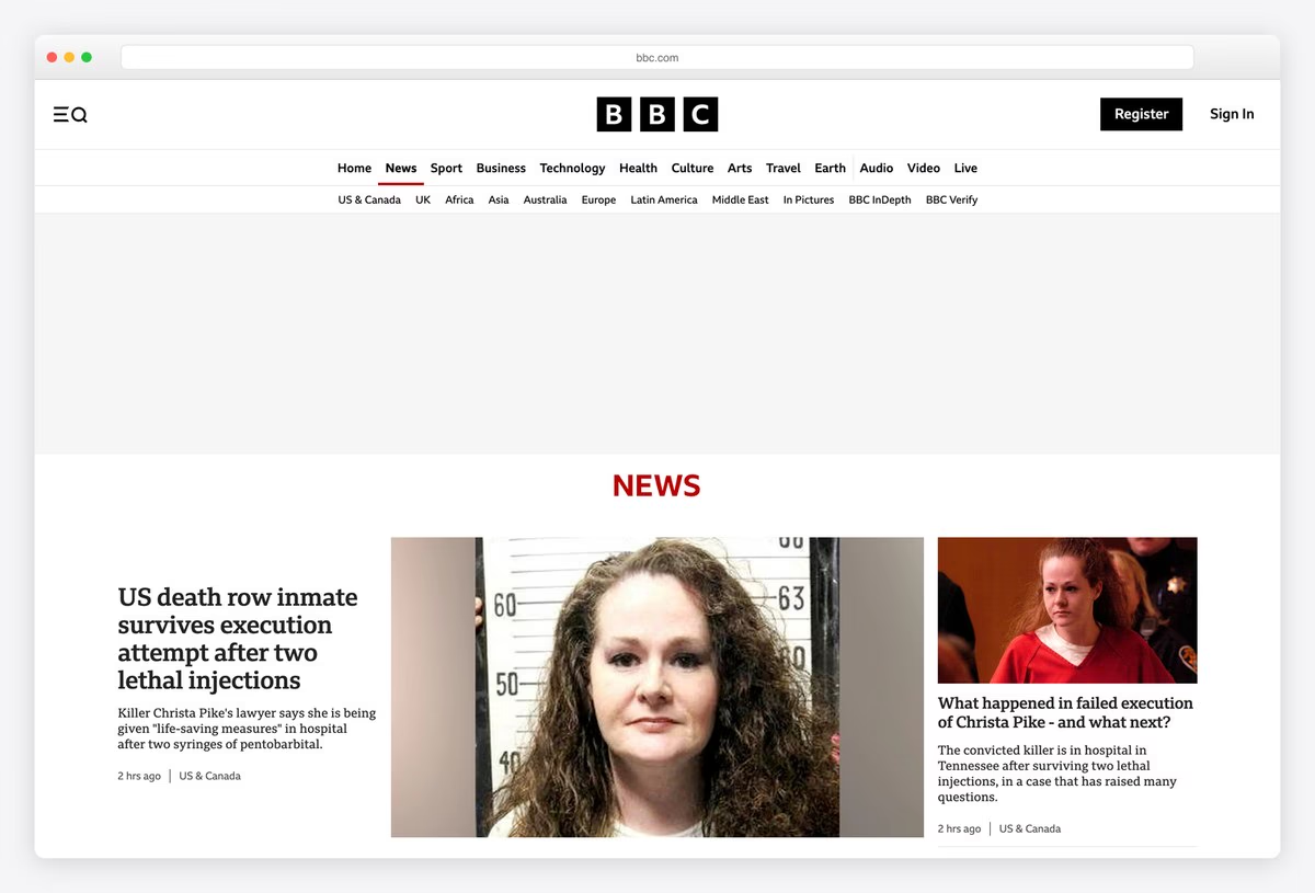
BBC News keeps its homepage calm for a site of its size: a slim black bar with the BBC blocks, a single row of sections, and a white page where one lead story and a handful of secondary stories carry most of the weight.
Headlines and text use BBC Reith, the corporation’s own type family, which unifies news, sport and iPlayer. The front end is built with Next.js, and regional editions (US & Canada, UK, Africa, Asia and more) sit in the second navigation row rather than in a separate site.
What stands out: A huge newsroom with an unusually quiet homepage.
7. Le Monde
Built with: Custom code · headlines in The Antiqua B
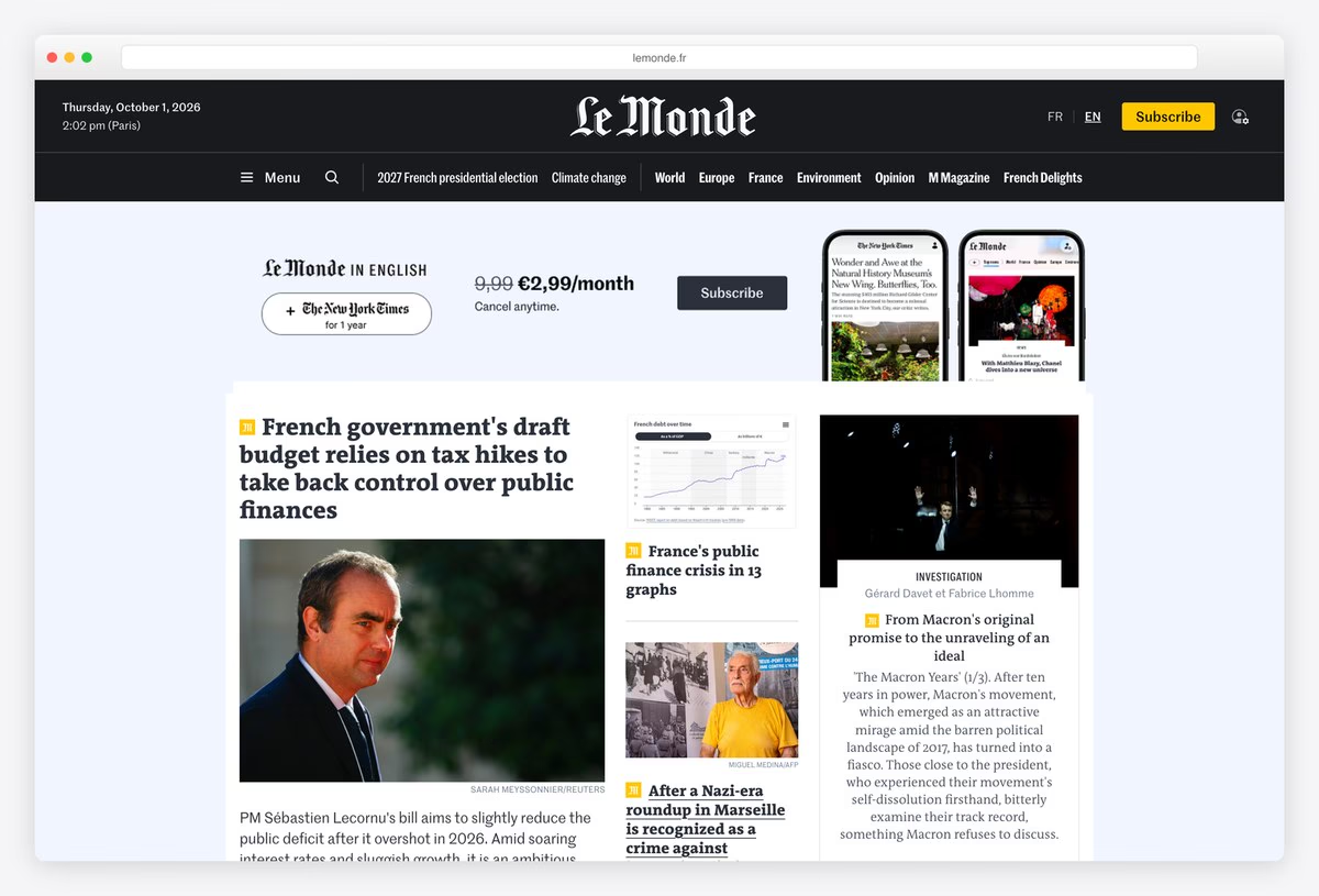
Le Monde’s English edition keeps the French paper’s look: a black header with the blackletter wordmark, the date and the time in Paris, and a bright yellow Subscribe button that is hard to miss.
Stories sit in a dense grid with headlines in The Antiqua B, a serif with a strong editorial voice, and a subscription block shows the offer next to the lead story. It shows how a translated edition can share one design system with the original.
What stands out: A translated edition that looks exactly like the original.
8. Neue Zürcher Zeitung
Built with: Custom code · headlines in NZZ Serif
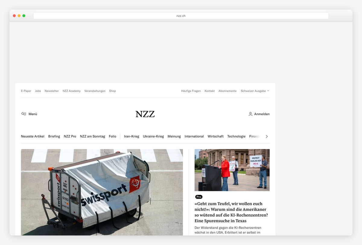
The Neue Zürcher Zeitung, Switzerland’s paper of record, opens with almost nothing above the news: a small wordmark, a long row of sections from Briefing to Feuilleton, and then large photographs with headlines underneath.
Headlines are set in NZZ Serif and text in NZZ Sans, both drawn for the paper, and colour is kept to a minimum. It is a lesson in letting photography and typography carry a page without boxes, badges or bright buttons.
What stands out: Minimal chrome, custom type and big photography.
9. Le Temps
Built with: Custom code · headlines in Financier Title
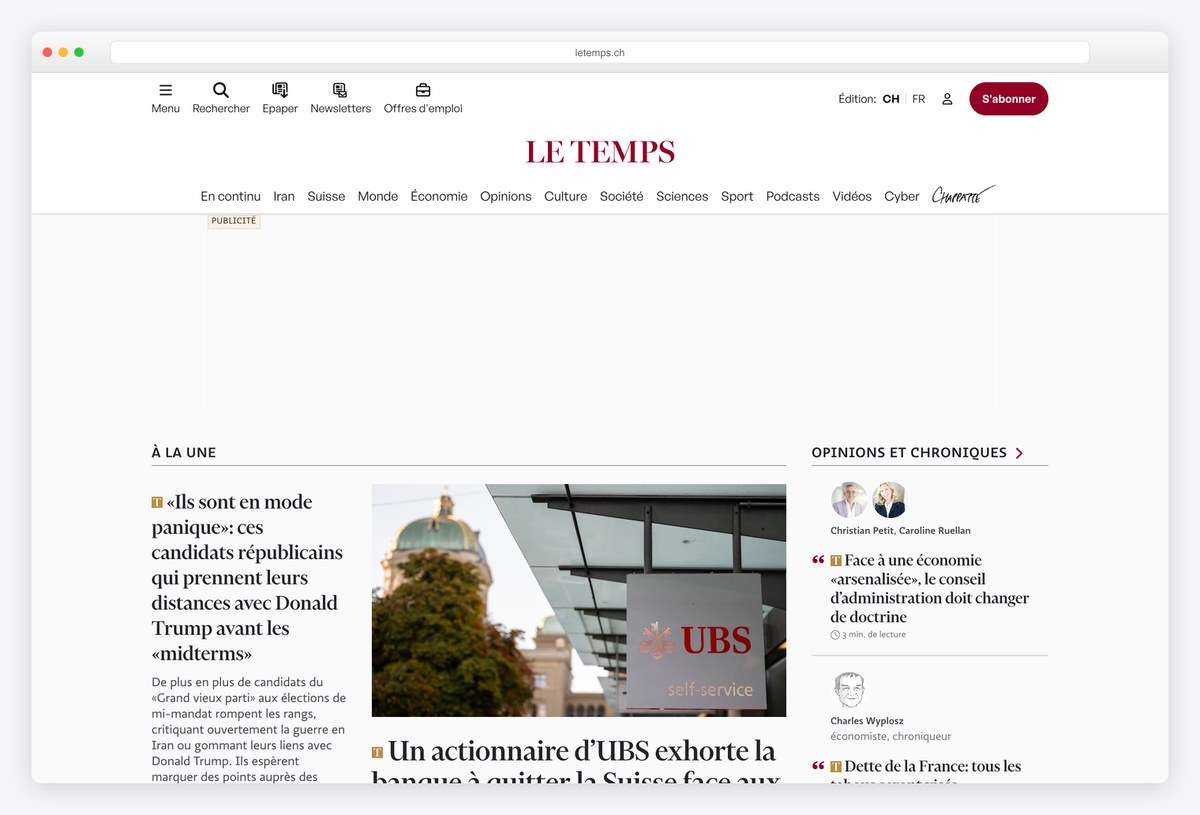
Le Temps, the Geneva daily, centres its red wordmark over a compact menu and a bright red Subscribe button, then splits the front page into a lead column labelled À la une and a column of opinion pieces with author photos.
Headlines use Financier Title over Ratio Sans body text, which gives the site a sharper, more modern feel than many Swiss papers. The separate opinion column is a smart structural choice: commentary is always one glance away, but never mixed into the news.
What stands out: News and opinion kept side by side but clearly separate.
10. Die Zeit
Built with: SvelteKit
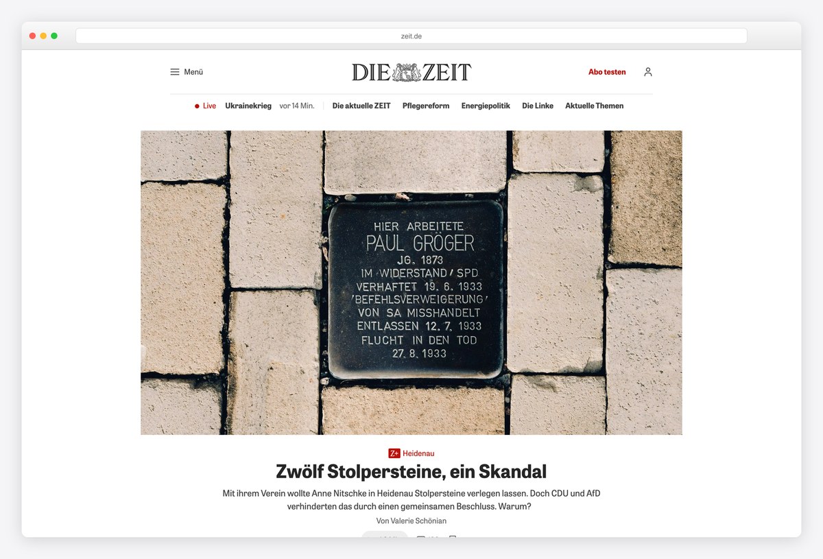
Die Zeit’s site leads with one large photograph and a single headline, with a red Abo testen (try a subscription) button and a short row of current topics above it, before the page settles into a grid of stories.
The front end is built with SvelteKit, and each teaser shows the author, the time and the number of comments, which reflects how central reader discussion is to Zeit Online. It is a good example of a news homepage that starts with one story instead of twenty.
What stands out: One lead photograph, then the grid.
11. The Times
Built with: Custom code · headlines in Times Digital
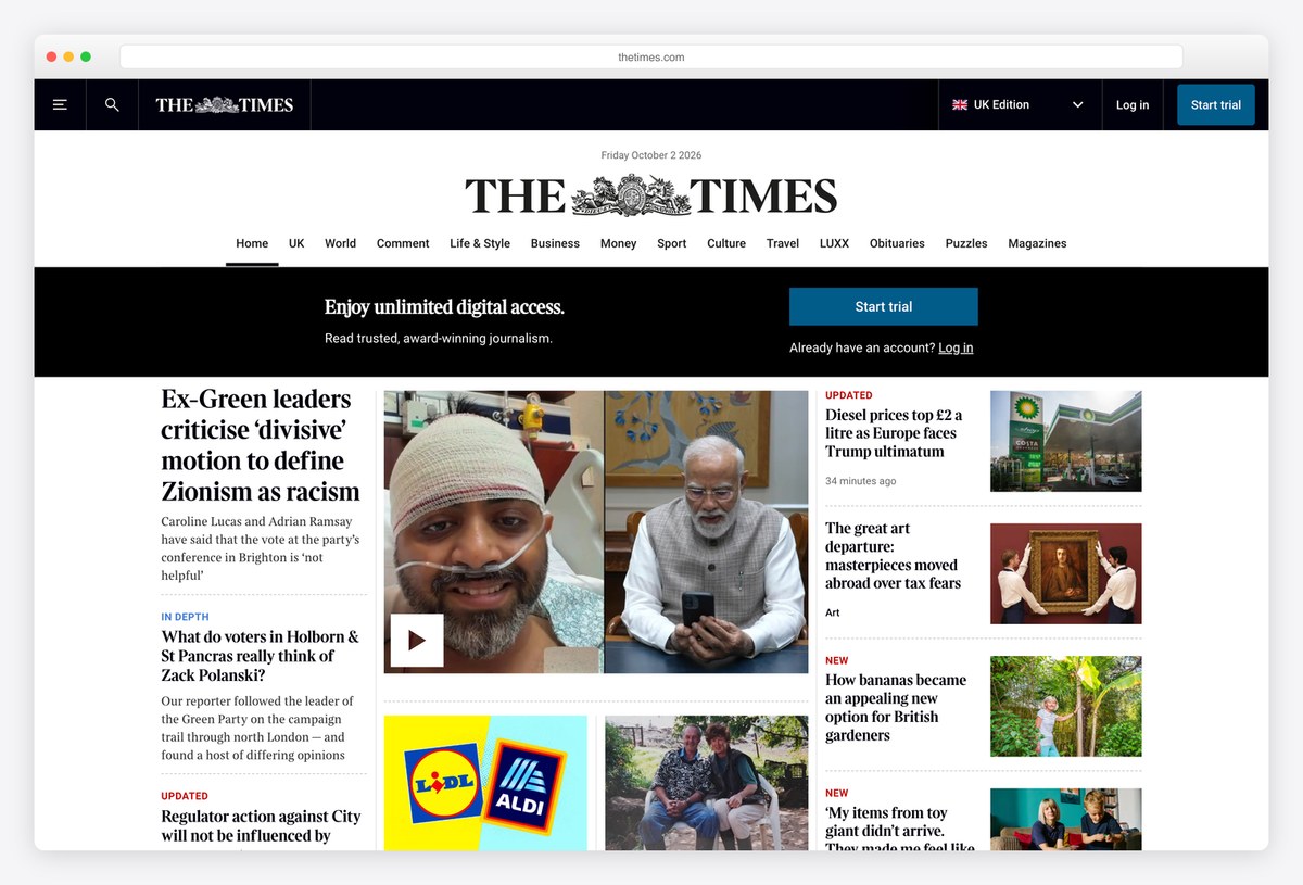
The Times centres its serif nameplate, with the royal coat of arms between the two words, under a slim black bar that holds search, an edition switch, Log in and a Start trial button. A row of sections runs underneath, from UK and World to Obituaries, Puzzles and Magazines.
The front page follows the printed paper: headlines in Times Digital, the paper’s own typeface, a lead story beside a large photograph, and narrow columns of stories divided by thin rules. A black subscription band sits between the masthead and the news, clearly separate from the stories. The site is custom-built.
What stands out: A print front page, down to the coat of arms.
Weekly and monthly titles, business news and tech publications, where the homepage behaves more like a cover than a front page.
12. The Atlantic
Built with: Next.js · headlines in A Garamond Pro
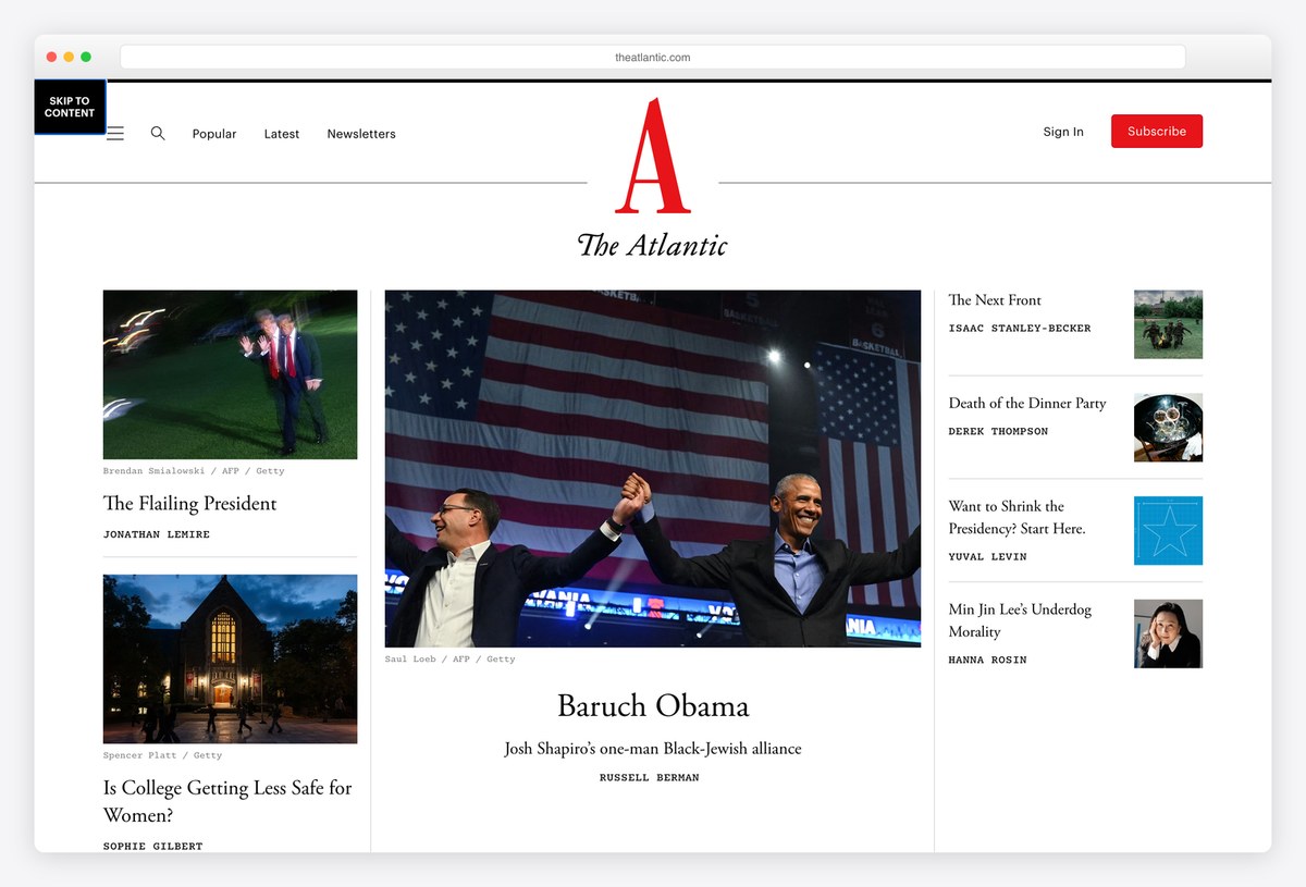
The Atlantic opens with its red serif A and a magazine-style front: one large illustration or photograph for the lead story, a column of smaller features beside it, and author names set in capitals under each headline.
Headlines are set in A Garamond Pro, and the site runs on Next.js. The layout reads more like a table of contents than a news feed, which suits a publication built around long essays, and the Popular and Latest links cover readers who want a stream instead.
What stands out: A news site that behaves like a magazine cover.
13. The New Yorker
Built with: Custom code
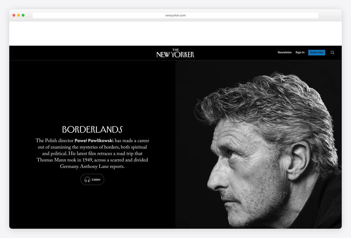
The New Yorker gives its lead story the whole first screen: a black background, a large black-and-white portrait or illustration, and a short headline and standfirst set beside it, before the page opens into its usual grid of stories and cartoons.
Text throughout is set in a Garamond, close to the magazine’s print voice, and the navigation is reduced to a few links. The full-bleed opener turns each day’s top story into something closer to a cover than a headline.
What stands out: Every day’s lead story gets cover treatment.
14. TIME
Built with: Next.js · headlines in PP Editorial New
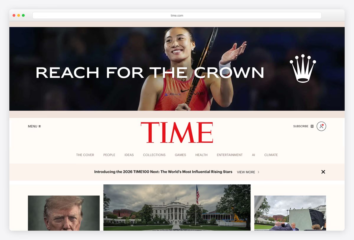
TIME uses its famous red masthead as the anchor of the homepage, with the section menu tucked underneath, a strip promoting its latest list or issue, and a row of large photographs for the top stories.
Headlines are set in PP Editorial New, a sharp contemporary serif, and the site runs on Next.js. The design leans on the brand’s print heritage (the red border and wordmark) while keeping the digital layout simple.
What stands out: Brand heritage from the cover, carried into a clean layout.
15. Bloomberg
Built with: Next.js · headlines in BW Haas Head
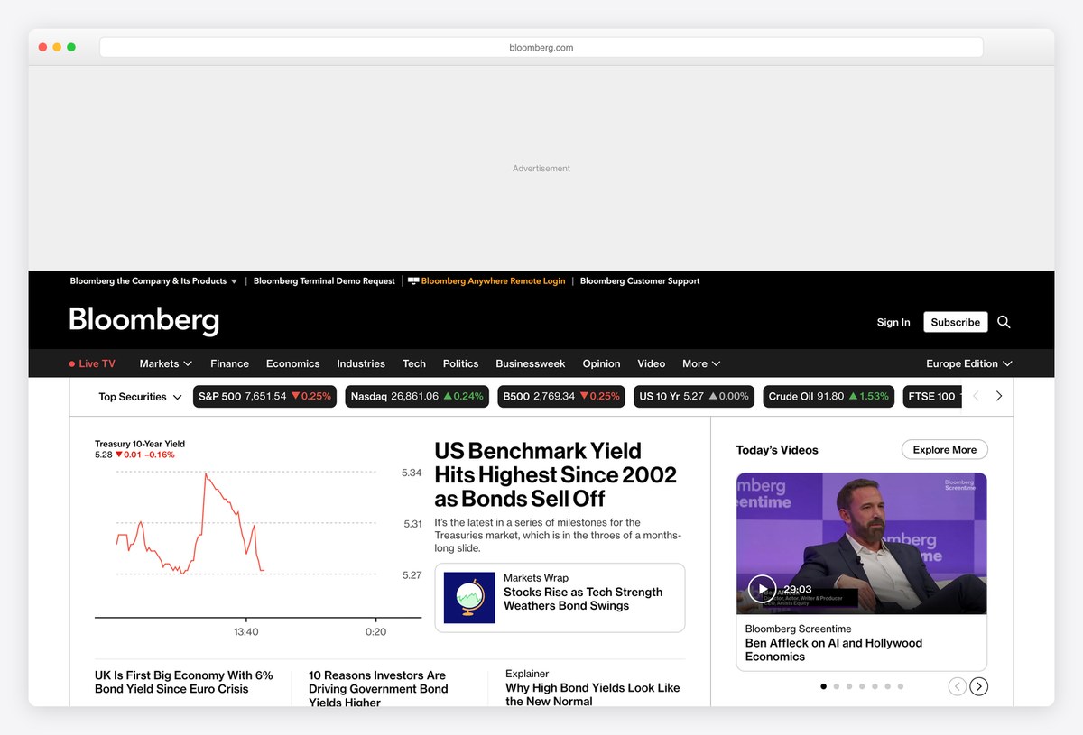
Bloomberg’s homepage is built for markets: a ticker of top securities (S&P 500, Nasdaq, Treasury yields, crude oil, gold and currencies) sits under the navigation, and the lead story often comes with a live chart rather than a photograph.
Headlines are set in a version of Haas Grotesk drawn for Bloomberg, and the front end is built with Next.js. The dark navigation bar and data-first layout make it feel like a lighter cousin of the Bloomberg Terminal, which is exactly the point.
What stands out: Data first, stories second, by design.
16. Wired
Built with: Custom code · headlines in Wired Display
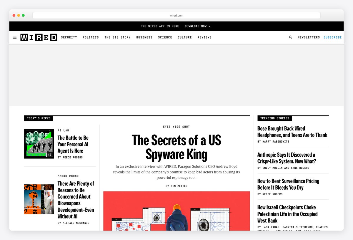
Wired keeps its black-and-white identity: the WIRED wordmark with its alternating boxed letters, a black navigation bar, and a centre column where the lead story’s headline is set very large in Wired Display, flanked by columns of smaller stories.
Text is set in a Garamond, a deliberate contrast with the tech subject matter, and red labels mark story types. The three-column front works like a magazine spread, with the lead story clearly in charge.
What stands out: A bold display face that makes the lead story unmistakable.
17. The Verge
Built with: Next.js
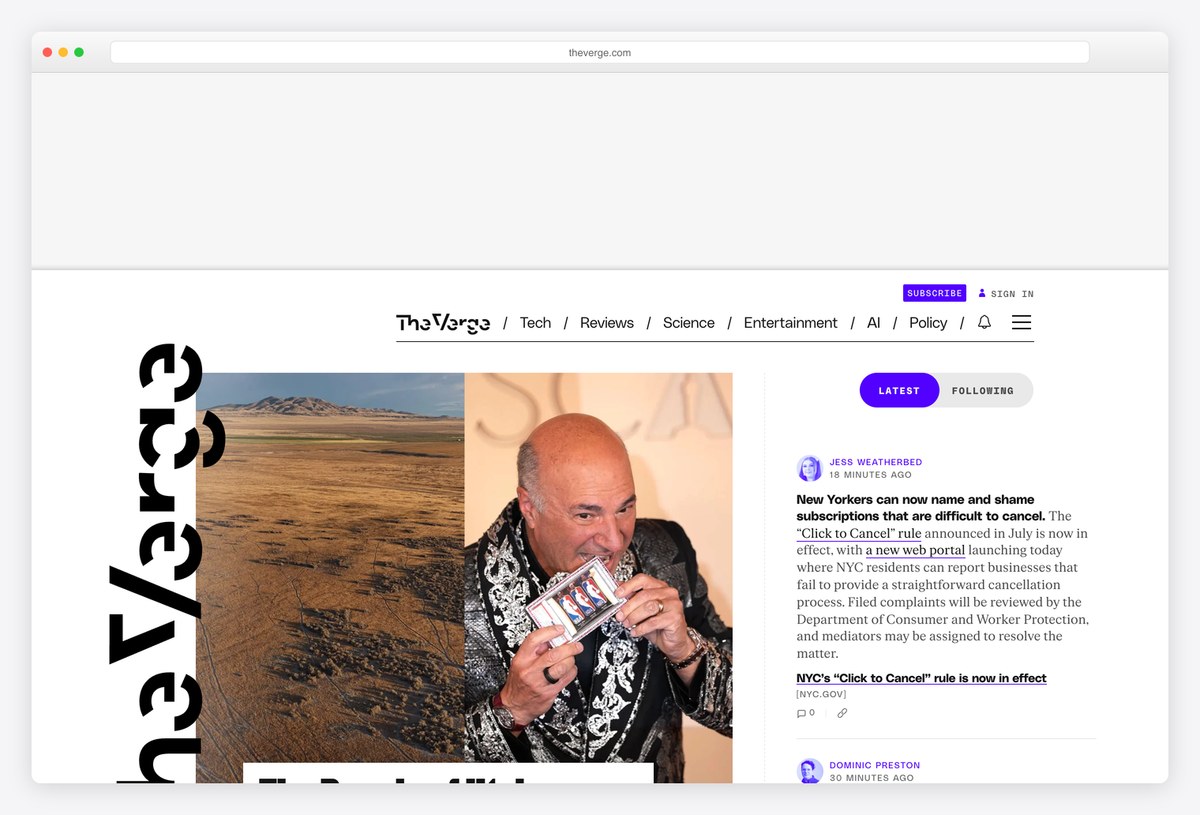
The Verge is the most typographically adventurous site here: its wordmark runs sideways down the left edge, story cards overlap each other, and bright accent colours mark the latest posts in a running feed on the right.
The front end is built with Next.js. The design breaks most newspaper conventions on purpose, and it works because the hierarchy is still clear: one big lead story with a large image, then a quick feed of everything else.
What stands out: Breaks newspaper rules on purpose, without losing the hierarchy.
18. Variety
Built with: WordPress
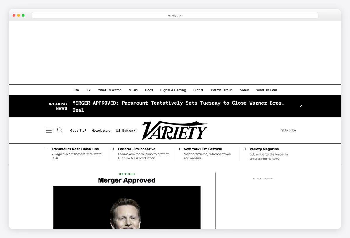
Variety puts breaking entertainment news in a black banner across the top, then its classic wordmark over a row of sections such as Film, TV, What To Watch, Music and Awards Circuit, with a U.S. edition switch beside it.
It runs on WordPress, and the layout is built for speed of scanning: short headlines, a strong lead image and a dense list of trade stories. For an industry trade paper, being quick to read beats being decorative.
What stands out: A trade paper’s homepage tuned for scanning.
19. TNW
Built with: Custom code · headlines in Graphik Wide
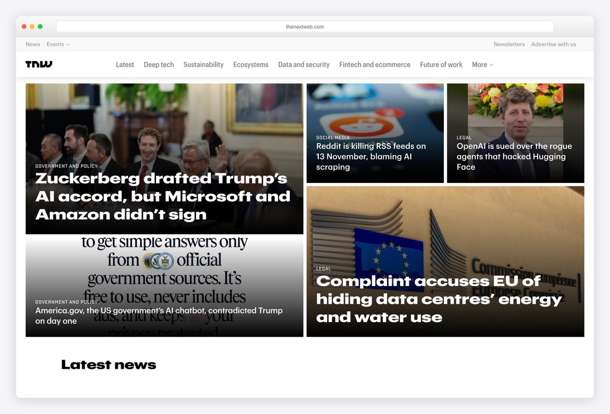
TNW, the European technology publication, uses a tile grid where images and headlines share the same boxes: text sits on top of a photograph, with a small category label (such as Government and Policy or Social Media) over each headline.
Headlines are set in Graphik Wide, a broad sans that suits large overlaid text, and the navigation splits the site into themes such as Deep tech, Sustainability and Future of work. It is a good model for a tech or startup news site that wants to feel bold without a magazine budget.
What stands out: Headline-on-image tiles that make a grid feel bold.
20. Al Jazeera
Built with: WordPress
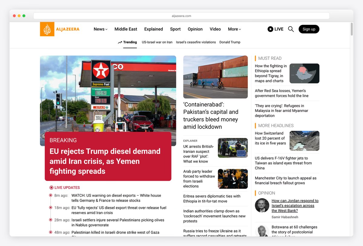
Al Jazeera’s English site uses its orange calligraphic logo, a short menu (News, Middle East, Explained, Sport, Opinion, Video) with a Live button for its TV channel, and a Trending row of topic links underneath.
The lead story gets a large photograph with a red Breaking label over its headline, followed by a list of live updates with timestamps, while Must Read and More Headlines columns run down the right. Skip links jump straight to the featured content, the feed and the most read stories. It runs on WordPress.
What stands out: Breaking news and live updates built into the front page.
21. HuffPost
Built with: Custom code · headlines in Proxima Nova Condensed
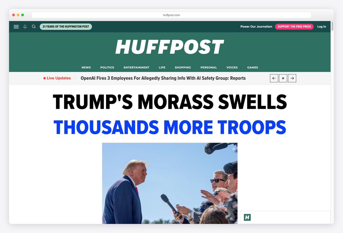
HuffPost sets its italic wordmark on a deep green band, with links asking readers to support its journalism in the bar above and a menu of News, Politics, Entertainment, Life, Shopping, Personal, Voices and Games below.
The lead is pure typography: the top story’s headline in huge Proxima Nova Condensed capitals across the full width of the page, with a live updates ticker above it and a photograph below. The site is custom-built. It is the opposite of a dense grid, and it makes one story impossible to miss.
What stands out: A headline set like a poster.
Digital-Native and Independent News Websites
Newer and smaller newsrooms, many nonprofit, whose designs show what a news site can look like without a century of print habits.
22. Rest of World
Built with: WordPress · headlines in Moderat
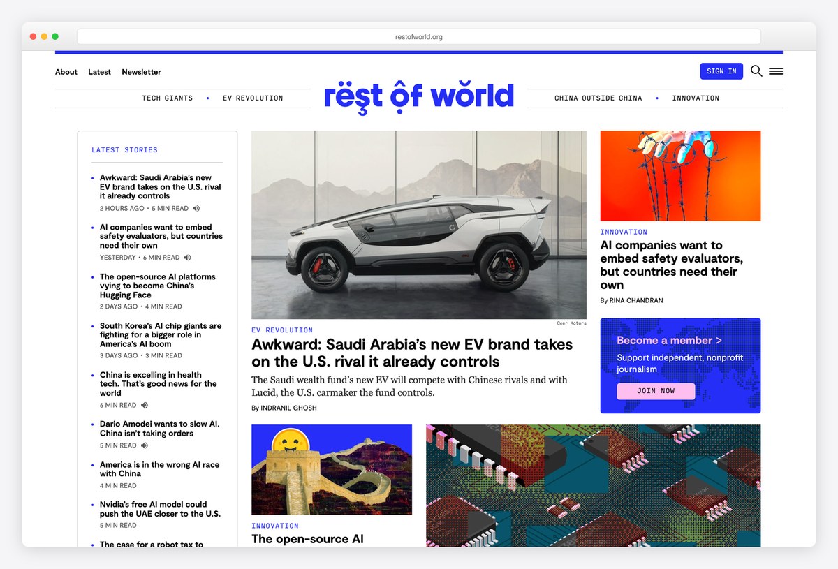
Rest of World, a nonprofit covering technology beyond the Western bubble, combines a narrow column of latest stories, each with a time stamp and read time, with a larger lead story and illustrated features in the middle of the page.
Headlines are set in Moderat and text in Georgia, and the site runs on WordPress. Theme tags such as Tech Giants and China Outside China sit above the content, so recurring beats are easy to follow.
What stands out: Read times and beat tags that make a niche publication easy to follow.
23. Axios
Built with: Next.js
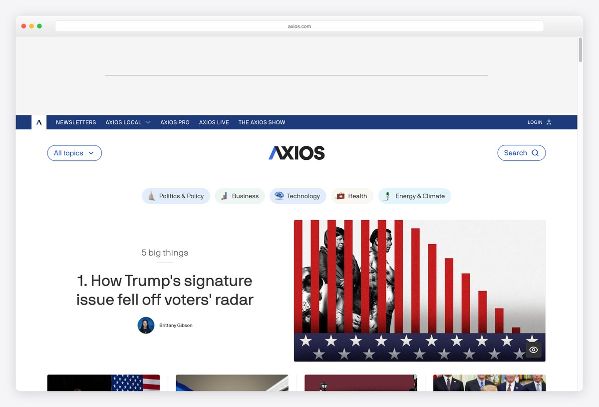
Axios is built around its famous brevity: the homepage leads with “5 big things”, a numbered list of the day’s stories, each with an author and a short summary, beside a large image for the first item.
Topic tabs (Politics & Policy, Business, Technology, Health, Energy & Climate) sit above the list, and links to Axios Local, Pro and Live run across the top. It is built with Next.js, and the numbered list format is the design: readers know exactly how much they have left to read.
What stands out: A numbered list that tells readers how much is left.
24. The Intercept
Built with: WordPress · headlines in TI Actu
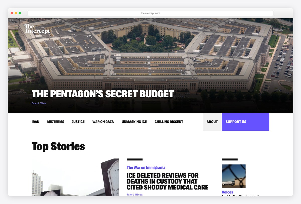
The Intercept opens on a full-width photograph with the lead investigation’s headline set over it in capitals, followed by a row of topics and a Top Stories grid with bold red labels.
Headlines use TI Actu, the publication’s own condensed face, and the site runs on WordPress. The heavy type and strong photography suit adversarial investigative reporting, and the purple Support Us button sits in the topic bar where readers will see it.
What stands out: Investigative journalism given the visual weight of a magazine cover.
25. ProPublica
Built with: WordPress
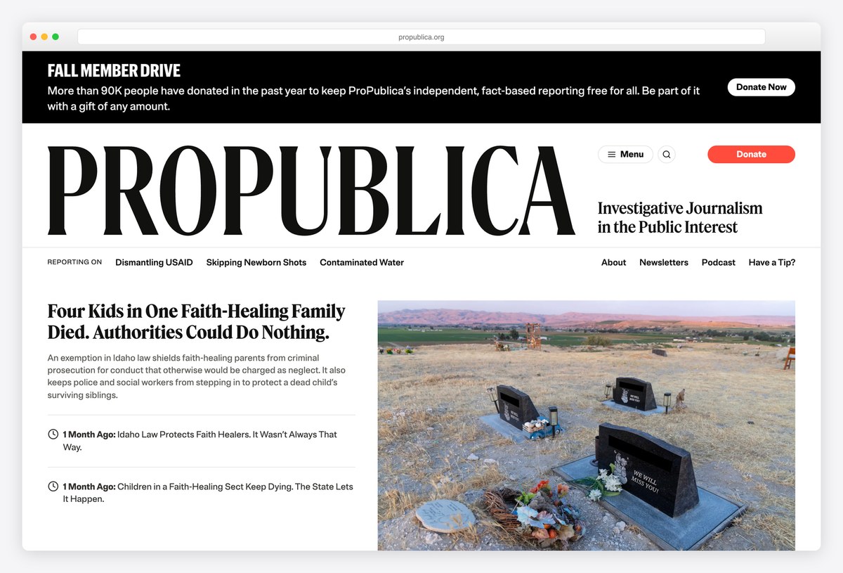
ProPublica’s homepage starts with a slim banner for its member drive, then a very large PROPUBLICA wordmark with the line Investigative Journalism in the Public Interest, and a lead story with a big photograph.
It runs on WordPress, and a Reporting On row lists the investigations it is following. Because the newsroom is nonprofit, the Donate button gets the same prominence a commercial site gives Subscribe.
What stands out: A nonprofit newsroom that designs around donations.
26. Coda Story
Built with: WordPress · headlines in Vesterbro
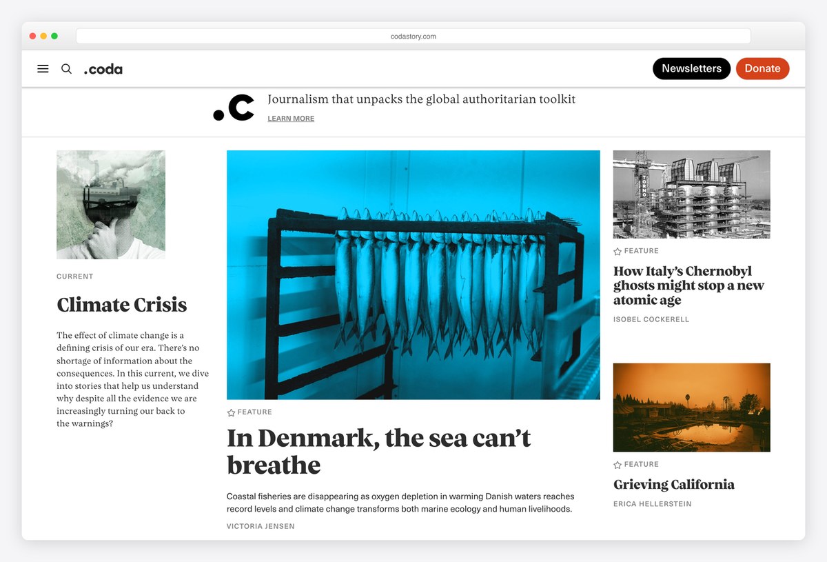
Coda Story is organised by what it calls Currents, long-running themes such as Authoritarian Technology, Disinformation and Climate Crisis, and the homepage gives one Current a full introduction before the latest stories.
Headlines are set in Vesterbro, a characterful serif, over generous white space, and the site runs on WordPress. Building navigation around themes rather than daily news suits a publication about slow-moving stories.
What stands out: Navigation built around long-running themes, not the news cycle.
27. The Pudding
Built with: SvelteKit · headlines in Gooper
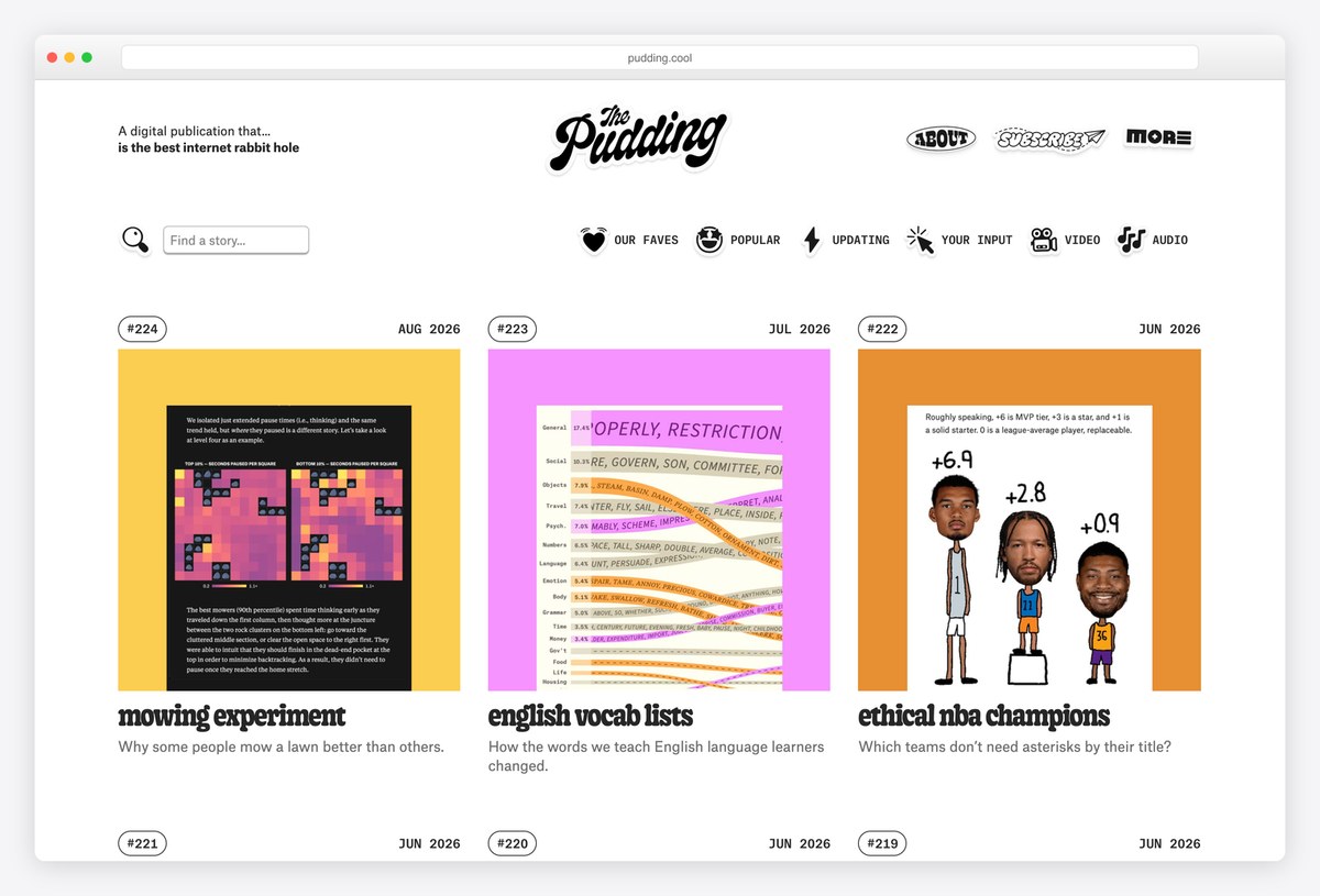
The Pudding is “A digital publication that… makes awesome stories with data”, and its homepage is a grid of numbered visual essays, each with an issue number, a month, a colourful thumbnail and a one-line question.
Headlines are set in Gooper, and the site runs on SvelteKit, which suits a publication where every story is its own small interactive app. The numbered issues make a website feel like a series you can collect.
What stands out: Numbered issues that turn a website into a collection.
28. The Art Newspaper
Built with: Next.js
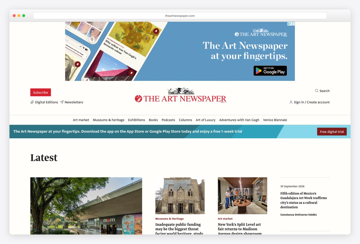
The Art Newspaper, “the journal of record for the visual arts world”, keeps a newspaper structure with a red wordmark over sections such as Art market, Museums & heritage and Exhibitions, and a Latest grid of stories with large images of artworks and buildings.
The site is built with Next.js and sets its text in Greta Sans. Its digital editions and app are promoted at the top, which reflects how many readers still want the paper as an edition rather than a feed.
What stands out: A specialist newspaper that still thinks in editions.
29. Monocle
Built with: WordPress VIP · headlines in Plantin
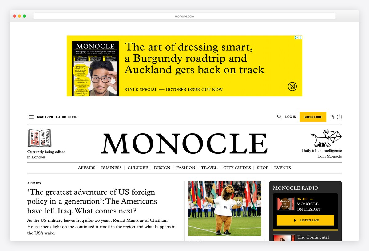
Monocle, the global affairs and design magazine, uses Plantin for its wordmark and headlines, a bright yellow promotion for the latest issue, and a small set of sections (Affairs, Business, Culture, Design, Fashion, Travel) under the masthead.
The site runs on WordPress VIP and also carries Monocle Radio, with a player promoted on the homepage. It is a print-first brand that treats the website as one more outlet, and the warm, classic type makes that feel deliberate.
What stands out: A print-first brand with radio and a website in one place.
30. Good Good Good
Built with: Webflow · headlines in Futura PT
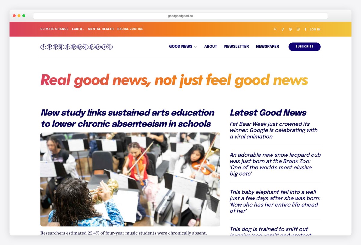
Good Good Good publishes “Real good news, not just feel good news”, and the homepage says exactly that in a large red italic headline under a rainbow gradient bar, followed by a lead story and a column of Latest Good News.
Headlines are set in Futura PT and text in Kepler, and the site runs on Webflow. Topic tags such as Climate Change and Mental Health sit at the top, and the publication sells a printed newspaper alongside the website, linked from the main menu.
What stands out: A cheerful identity that still reads as serious news.
What Makes a Great News Website Design?
Make the lead story unmistakable. Every strong front page here has one story clearly in charge, through size, a large image or a full-width opener, as on The New Yorker and The Intercept. When everything is the same size, readers have to do the editor’s job.
Rank stories with type, not boxes. The New York Times, NZZ and the Financial Times separate stories with headline size and thin rules rather than cards and borders, which lets dozens of stories share a page without clutter.
Invest in a typeface. Twenty of the sites on this list set their headlines in a named face, many drawn for them: Guardian Headline, Financier Display at the FT, BBC Reith, NZZ Serif. A distinctive headline face is the cheapest way to make a news site recognisable without a logo in sight.
Give sections a visible system. The Guardian colour-codes its sections and Rest of World tags recurring beats, so readers learn the structure once and can scan any page.
Put live information where readers look first. Business titles lead with data: Bloomberg and the Financial Times run market tickers under the navigation. Regional papers lead with local life, like the Los Angeles Times’ live camera feeds.
Ask for support without hiding the news. The best subscription and donation prompts are visible but separate: Le Monde’s yellow Subscribe button, ProPublica’s member-drive banner, the Times’ label marking which stories are free. Full-screen gates on the homepage push first-time readers away before they have read anything.
Keep it fast and accessible. News pages carry heavy ads and media, so lazy-load images below the first screen, reserve space for ads so the page does not jump, and keep a skip-to-content link. Most of the large papers here start with one, and every news site should.
Frequently Asked Questions
What makes a good newspaper website design?
A good newspaper website has a clear hierarchy, with one obvious lead story, headlines ranked by size and sections that are easy to tell apart. It also loads quickly, works on phones, uses a readable typeface and keeps subscription prompts from hiding the news. The best examples here keep the structure of a printed front page and add live data and video.
What platforms do news websites use?
Large publishers usually run a dedicated publishing system with a modern front end. On this list the Washington Post uses Arc XP, its own platform, the Los Angeles Times uses Brightspot, and many sites, including the BBC, Bloomberg and The Atlantic, build their front ends with Next.js. Smaller newsrooms such as ProPublica, Rest of World and The Intercept use WordPress.
Can I build a news website with WordPress?
Yes. WordPress powers many newsrooms on this list, including The Intercept, ProPublica, Rest of World, Coda Story and Variety, and Monocle runs on WordPress VIP, the managed version for large publishers. A news or magazine theme gives you the grid layouts, categories and author pages a news site needs, and you can add a paywall or membership plugin later.
What fonts do newspaper websites use?
Many major newspapers use custom typefaces: the Guardian uses Guardian Headline, the Financial Times uses Financier Display, the BBC uses Reith and the NZZ uses NZZ Serif and Sans. Serif faces remain common for headlines because they echo print, often paired with a sans-serif for navigation and labels. For your own site, a well-made serif such as Georgia is a solid free choice.
How should a news website show subscriptions or paywalls?
Make the offer visible without blocking the reading experience. Clear Subscribe or Donate buttons in the header, a short banner for a member drive and labels on which stories are free all work well. Avoid full-page gates on the homepage: first-time readers who cannot see any news usually leave instead of subscribing.
Should a news website use dark mode or infinite scroll?
Both are optional. Dark mode is appreciated by readers at night, and some sites follow the device setting automatically. Infinite scroll suits feeds, such as The Verge’s latest posts, but a front page works better as a finite, edited set of stories with a clear end, which is closer to how readers think about a daily paper.
Wrapping Up
To build your own news site, browse our news WordPress themes, our magazine WordPress themes and these newspaper theme examples.
Browse the other Publishing, blogs & media website examples (8 more collections), or see website examples for every industry.
Was this article helpful?
YesNo
